In UX design, buttons orchestrate users' interactions and guide them through the product’s interface. A button goes beyond the basic idea of a simple text button; there are many different variations with unique functions. This guide delves into prominent UX buttons, exploring their distinctive characteristics and providing insights into when and how to use them effectively. We cover most of the main button types, but there are definitely more out there! From the attention-grabbing Call-to-Action (CTA) to the unassuming yet powerful Outline/Ghost button, each type plays an important role in shaping a smooth user experience.

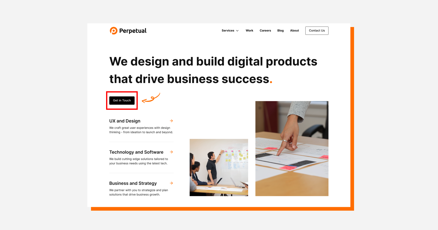
Call-to-Action (CTA) buttons are like powerful magnets, guiding users to key actions. They're loud, persuasive, and designed to boost conversions. The text for these buttons is often contained within a solid color fill to create a visually striking effect, though exceptions exist. CTA buttons drive users to an assigned task, so it is important to capitalize on their impact! Whether it's getting users to sign up, buy something, or take a vital step, CTAs are the champions of user engagement.
Best Use Cases: Try using CTA buttons for actions aligned with the primary goals of a page or screen, such as "Sign Up," "Buy Now," or "Get Started."
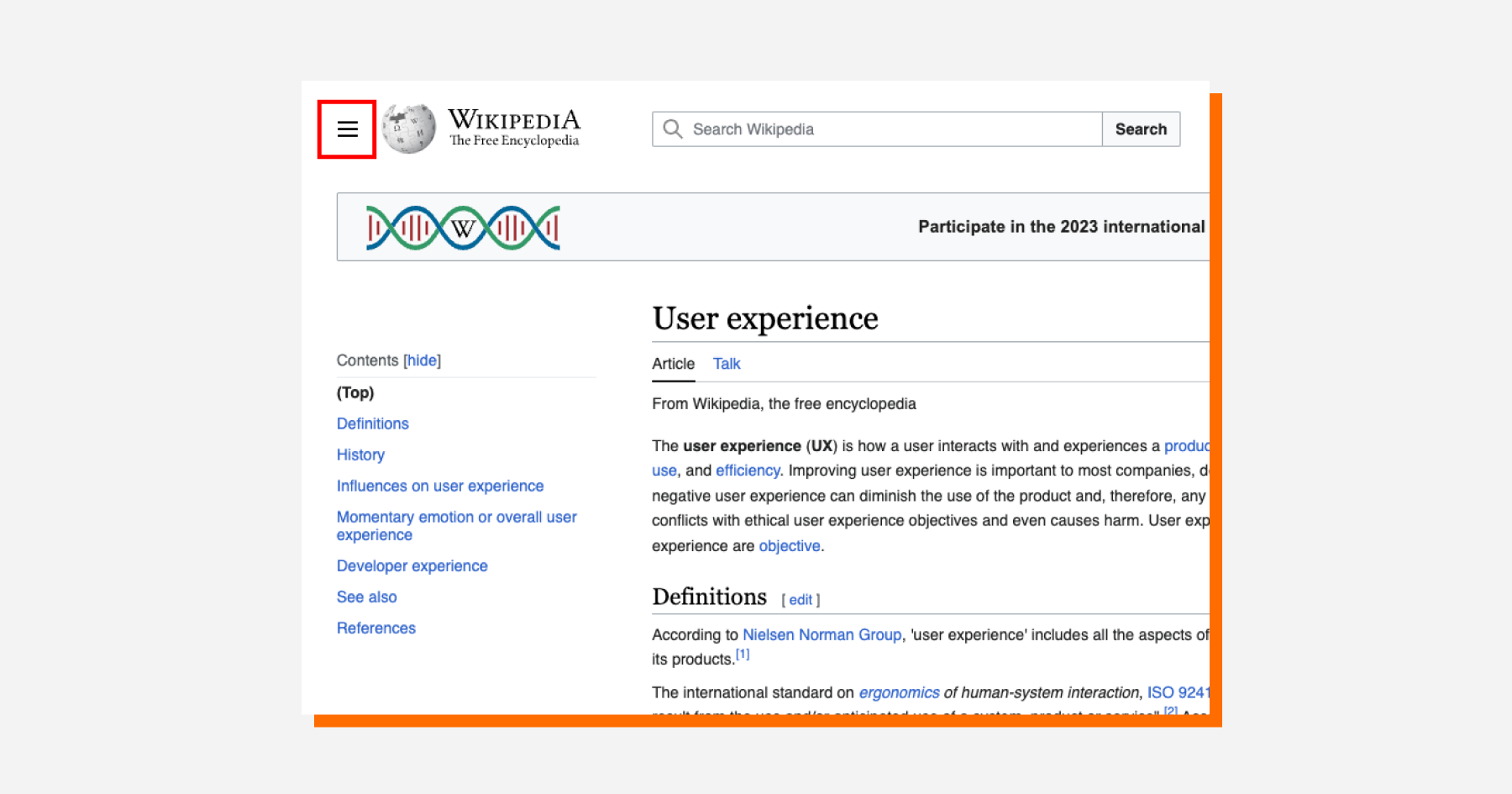
Hamburger buttons, with their three horizontal lines, serve as the access point to hidden navigation menus. Most users see a collapsed menu button as commonplace, but it has been argued that the functionality of a Hamburger button is not immediately obvious at first glance. While their appearance has been debated, they remain a popular choice for decluttering interfaces and providing a clean, minimalist look. When users seek additional navigation options, interacting with the hamburger button reveals another menu.
The concept of the Hamburger button has different variations, each with a slight change in shape. A trio of dots transforms it into a "Kebab" menu button, and when three lines descend in length, it becomes a "Strawberry" menu button, along with other adaptations. Nevertheless, the underlying concept remains consistent across these visual adaptations.
Best Use Cases: Make a hamburger button to hide secondary navigation options and keep a clean interface, especially on mobile devices.
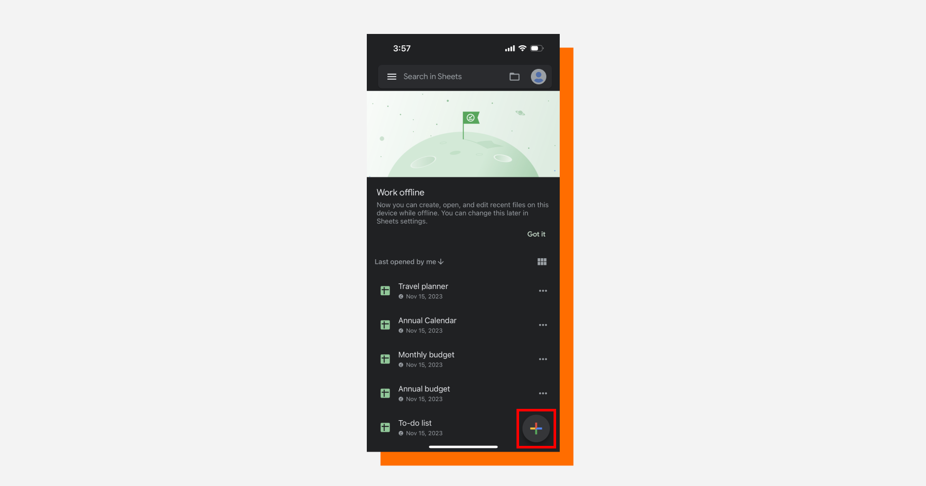
Plus symbols represent expansion, and that’s exactly what a Plus button does. It offers users the ability to add new elements or perform additional actions. Often seen in form designs or task-related interfaces, the plus button opens doors to new possibilities, providing a straightforward and visually intuitive way for users to expand their experience.
Best Use Cases: Integrate plus buttons in item-heavy interfaces like task lists, content creation, event calendars, or collaboration tools.
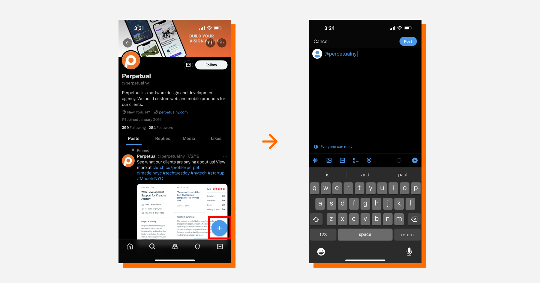
While Expandable buttons and Floating Action buttons (FABs) are usually categorized as separate button types, we would consider them the same type of button differentiated by their interactions. They both sit in a fixed position on the user interface and then differ when clicked upon.
Expandable buttons use their compact design to hide more options, only revealing themselves when interacted with. When space is at a premium, these buttons maintain the beauty of a minimalist appearance while helping to reduce information overload for users, optimizing both form and function.
Similarly, FABs are fixed navigators that float above the UI and content, providing quick access to primary actions. Their consistent positioning ensures accessibility regardless of the user's place on the page, making them great for promoting key interactions and frequently used actions. This is evident in the image above; on Twitter, the “compose new tweet” FAB follows users throughout their experience to promote the creation of new content.
Best Use Cases: Use expandable buttons or FABs in situations where space constraints demand a clean design, but additional options are still necessary.
Outline buttons (also known as Ghost buttons) have a minimal and transparent look, using thin border lines. They usually have plain text or simple icons that do not give off an overpowering feel. Outline/Ghost buttons find the right balance between visibility and subtlety, making them well-suited for secondary actions without overshadowing emphasized buttons like CTAs.
Best Use Cases: Use Outline/Ghost buttons for secondary or tertiary content, such as canceling an operation, providing additional options, or linking to supplementary features.
Extra Tip: These buttons can look like the input fields in forms if they’re not strategically positioned; ensure they do not become unnoticeable in your designs or confuse users!
Learning the art of button selection is key to creating intuitive user experiences. From the persuasive Call-to-Action button to the tidy Hamburger button, they all play a crucial role. The variety of button types, when carefully coordinated, collaborates to shape a digital experience that is not only practical but also enjoyable for the user. As designers explore different button possibilities, it is crucial to understand each type's strengths and employ them purposefully to elevate a product’s user interface design.