In the field of UX design, certain principles from psychology can greatly impact the overall user experience. These laws help create more intuitive and human-friendly experiences.
In this new series of breaking down UX Design Principles, we are starting off with Hick’s Law.

This UX law is named after the British-American psychologist team of William Edmund Hick and Ray Hyman, it is sometimes referred to as Hick-Hyman Law as well.
In 1952, this pair started examining the relationship between the number of stimuli present and an individual’s reaction time to any given stimulus. Users provided with an overwhelming number of choices have to take time to interpret and decide, giving them unwanted extra work.
More options can mean increased flexibility of choice or an overwhelming amount of choices for users. This law describes that the number of choices and complexity can increase the user’s reaction time. The law is that the more complex and larger amount of choices you have, the longer it takes for you to make a decision. Hick’s law can be applied by simplifying and reducing the number of choices to get a faster decision.
A lot of today’s products and innovations have gone through various iterations to reduce their complexity and be easier understood. Knowingly or unknowingly, we have seen examples of how Hick’s law is all around us.

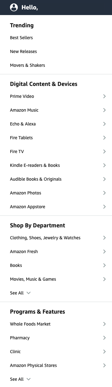
Amazon's navigation bar is a shining example of how to apply the principles of Hick's Law to improve the user experience. To counteract decision overload, Amazon categorizes its many options into categories within the navigation bar, making it easier for the user to find what they're looking for among Amazon’s vast offerings and products. This reduces the cognitive load on the user and enables them to quickly make a decision, improving the overall user experience on the site. The clear categorization of options minimizes the amount of time and effort required for the user to find what they're looking for, making Amazon's navigation bar a shining example of how to apply Hick's Law in practice.

Highlighting an option out of a group is a smart usage of Hick’s Law to ease the pain of making a choice, with your recommended highlight users can make a decision quicker. By drawing attention to one specific option, it gives the user an initial suggestion that can influence them to feel confident in making a choice. Above we can see how Duolingo automatically highlights the “regular” option for new users, they are making an immediate suggestion that takes the difficulty of choice away. With a narrowed focus, users can pick easier.
We all have had to sit through endless Netflix scrolling, trying to find the perfect TV show or movie to watch. Out of their countless choices, Netflix curates a list of the Top 10 shows or movies in your country.

Netflix has these sections to influence users into watching one of these shows or movies rather than continually scrolling, helping lessen the decision-making time. Additionally, Netflix is introducing its original content to this list and with the “top 10” branding, it helps audiences click their content faster.
Sometimes complexity is unavoidable, so we must try to simplify the decision-making process as much as we can. This is why landing pages are often used as a first introduction to a product or service, this is where you can make your initial impact and choose what you want to stand out.
Maybe use an enticing image before introducing text to let the user see what you want them to see first or maybe add categories to your lists to break them up.
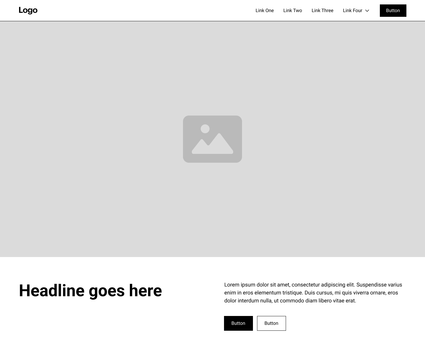
We see Hick’s law in the navigation of almost every website. By putting navigation links together in logical and expandable groups, we can reduce the number of options and provide progressive disclosure of information. You can see this in action under “Link Four” in the image below, relevant subpages become visible once you click the navigation link group.
Another way to apply Hick's Law is to provide users with clear visual cues and indicators to guide their decision-making. For example, designers can use color and other visual elements to highlight important options and help users quickly and easily identify the best choices.
By using tips like these, you are guiding their experience and interaction with your material.
In closing, Hick's Law is a fundamental principle of UX design that states the more choices and complex options there are, the longer it takes for users to make a decision. To decrease the decision-making time, it is important to simplify and reduce the number of choices. We have seen how the principles of Hick's Law can help create more intuitive and user-friendly experiences. Finally, remember K.I.S.S. (Keep It Short & Simple)!
If you would like to learn more about Hick’s Law, please feel free to look at this curated list below: