In the world of digital product design, success is often measured by what doesn’t go wrong. Apps should ideally be designed with simplicity and clarity to minimize errors due to user actions or inputs. The best way to deal with an error is to prevent it from happening in the first place. While some errors—such as server failures—may be unavoidable, many user errors often stem from unclear instructions or overly permissive inputs.
Designing for error prevention starts with anticipating potential failure points and proactively addressing them in design. In this post, we explore key principles and techniques of designing for error prevention and how they can be applied to create more resilient, user-centered digital experiences.

One of the most common causes of user error is open-ended input—forms or actions that allow for too much ambiguity. By thoughtfully constraining how users interact with an interface, we can significantly decrease the chance of incorrect or incomplete entries.
These constraints provide clear expectations and reduce the need for system correction later.
If users are unaware that something they’ve done is invalid or incomplete, they may proceed with incorrect data—leading to downstream errors or system failures.
Real-time feedback prevents costly errors by guiding users with timely, unobtrusive cues—helping them stay on track and complete tasks with confidence.
Another powerful preventative tool is offering intelligent defaults or suggesting actions based on context.
Well-considered defaults reduce the cognitive load on users and eliminate unnecessary guesswork, which is especially valuable in enterprise systems where forms can span dozens of fields.
In many interfaces, it's better to prevent users from executing an invalid action altogether than to allow it and then show an error.
Disabling invalid actions helps guide users away from mistakes—eliminating the need for disruptive warnings later.
In enterprise environments, users often deal with layered systems—like multi-step approval workflows, data syncing across platforms, or time-sensitive processes. Error-prevention design should anticipate where these systems can break or where users might lose track.
These touches are small but critical—they protect data integrity, reduce operational risk, and show that the system is designed with real use cases in mind.
Error-prevention design isn’t just about constraints—it’s also about proactive education. Tooltips, contextual help, and gentle nudges can all help users learn without feeling blocked.
When done well, these help elements reduce support burden and increase user independence—especially important when onboarding new users into complex systems.
Error-prevention design testing requires an approach that monitors for confusion, hesitation, or early signs of friction before errors occur. During usability testing, ask questions like:
Refining interfaces based on these insights is how good design becomes great error-prevention design.
In a recent project, we designed a behavioral assessment administration platform that included a particularly error-prone workflow for ordering assessments. Administrators provide respondents’ emails, and then the system sends invitation emails to respondents, allowing them to create accounts and complete their assessments.To reduce confusion and prevent errors, we broke this complex process into three clear steps and introduced a stepper to show progress. Each step includes descriptive guidance, tooltips, and info buttons to explain key settings and decisions.

For scheduling assessment emails, we prevented users from selecting past times by limiting time selection to future times only.

We also added protective checks to avoid common pitfalls:
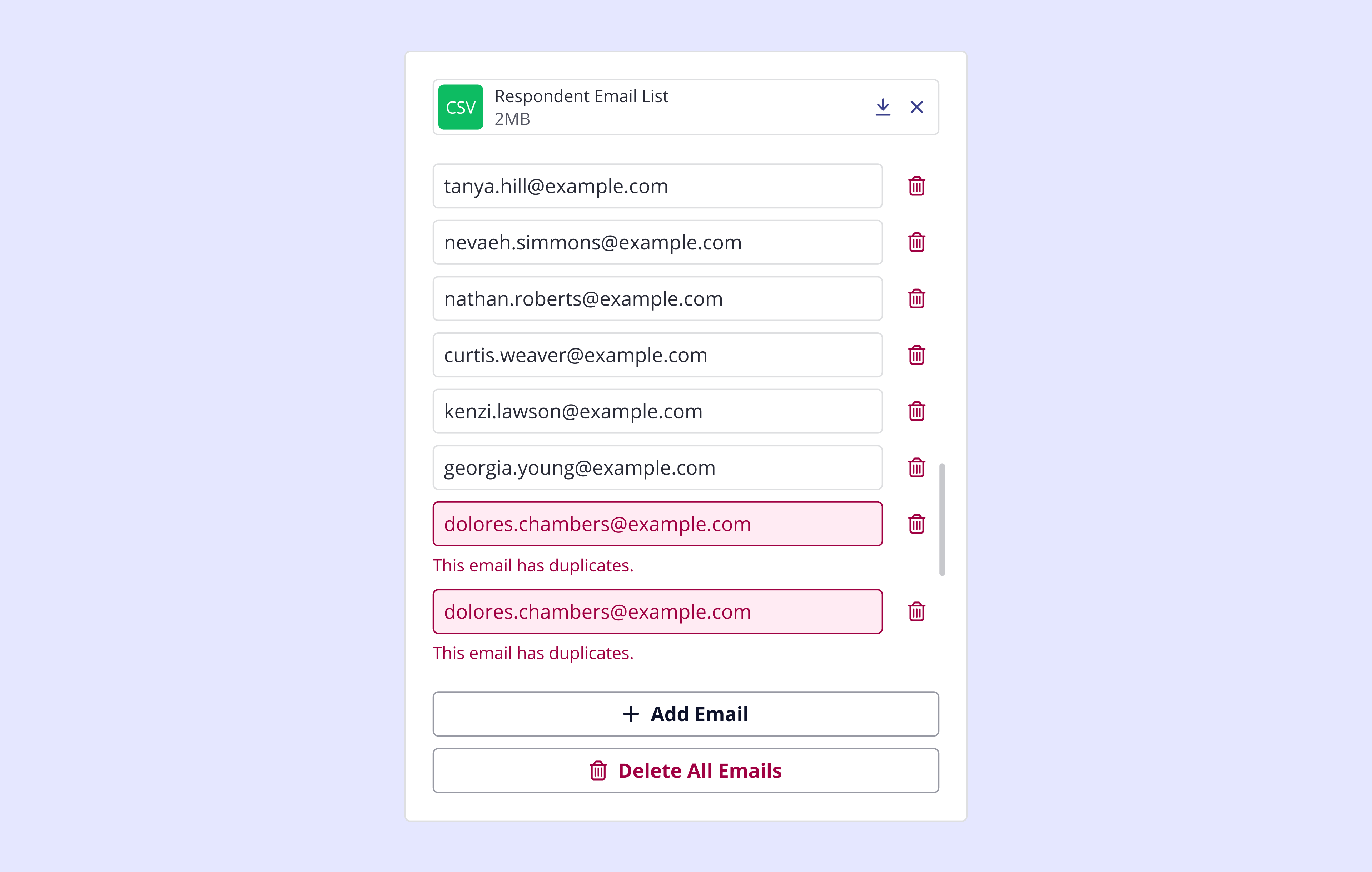


These preventative design strategies helped streamline the flow, reduce support issues, and increase administrator confidence in completing the task accurately.
Error-prevention design is ultimately about respect—for the user's time, attention, and context. By designing experiences that anticipate possible errors and quietly smooth them away, we make digital systems not only more usable, but also more humane.
The best UX often goes unnoticed. That’s the power of solving problems before they ever appear. Want to future-proof your product with thoughtful UX? Feel free to get in touch with us.