Across web and mobile digital interfaces, forms are the backbone of user interaction, serving as gateways to valuable data for businesses, organizations, and platforms. However, poorly designed forms can frustrate users, erode trust, and result in incomplete or unreliable data. This post dives into the art and science of designing complex forms that strike a delicate balance: capturing detailed, high-quality information while maintaining a seamless, engaging user experience. Whether you're a UX designer, product manager, or developer, these insights will help you craft forms that respect users’ time and encourage thoughtful, accurate responses.
We provide how to approach this challenge with an example from one of our recent projects: A global platform that connects regional suppliers with international buyers. To qualify for contract opportunities, local businesses are required to complete an extensive profile form with a vast amount of information. We applied design best practices to make this experience smooth, intuitive, and effective for users, as follows.

It was essential to gather information needed for data collection from the form users, i.e., the regional supplier applicants in our example. We worked closely with the project stakeholders to remove redundant questions and finalize a limited set of fields covering registration details, ownership, company operations, etc. To encourage full profile completion, we made one of the features, “Business Notices,” accessible only when the supplier's profile is 100% complete. Additionally, all required fields were set as mandatory to ensure data consistency and integrity.
Through active stakeholder communication, we learned that users of the supplier profile feature vary widely in their technical proficiency. While medium-to-large enterprises often have the resources to complete the application accurately, many small businesses struggle with the process of highlighting the need for a user-friendly and accessible form design.

As users are more prone to take action when complex activities are broken down into smaller tasks, we chose to break the long form into multiple sections spread across separate pages, reducing user friction. Thus, not only making the initial experience less overwhelming but also allowing us to group related questions under clear, descriptive titles for better clarity and flow.
When structuring the sections, we intentionally placed the easier, less sensitive questions at the beginning. As users progress through the form, they encounter more complex or sensitive fields—but by that point, they’re less likely to abandon the process due to the effort already invested. This approach leverages the “sunk cost fallacy,” a behavioral principle that increases the likelihood of task completion as users become more committed over time.

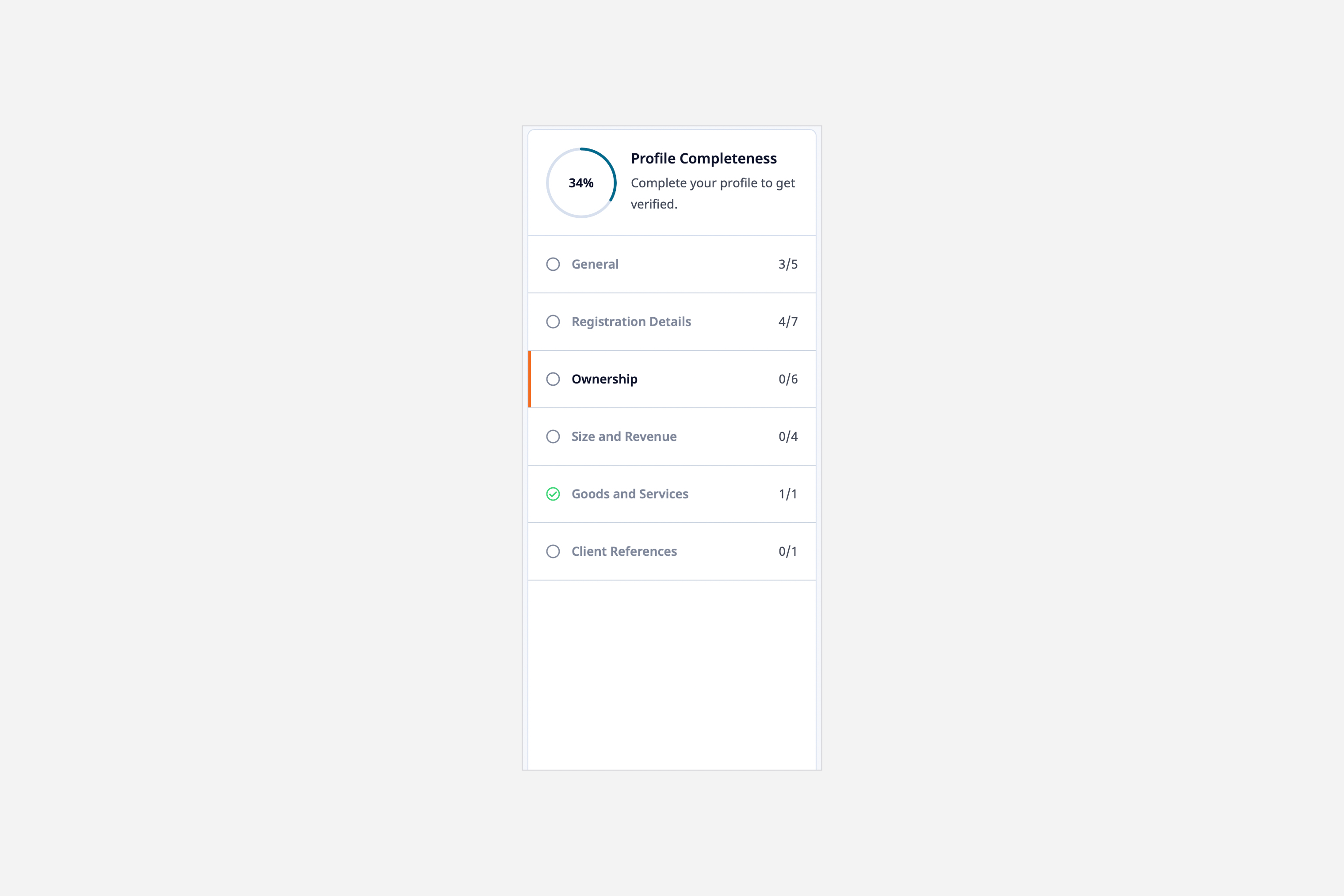
As a result, the planned grouping and sequencing of the form questions are as follows, starting with general information and progressing into more business specific details:

To further support user motivation and reduce drop-off, we implemented a progress tracker alongside the form. This visual indicator updates in real time as users complete each question, giving them a clear sense of how far they’ve come and how much remains. By making progress visible, the tracker reinforces momentum and encourages users to continue through to completion.
After discussing data-saving strategies with stakeholders, we decided to implement individual question-level saving. While this requires users to click “Save” after each question - adding some friction - it was the most reliable solution given our context. Many suppliers are located in remote rural areas with unstable internet connections, and this approach minimizes the risk of data loss. It also reassures users by providing immediate confirmation that their input has been securely recorded.
Additionally, we recognized that some users may not have all the required information on hand. By allowing partial progress to be saved at the question level, users can complete what they know and return later, promoting more flexibility.
To enhance data quality and minimize user errors, we applied targeted validation rules to critical fields such as email, phone number, and percentage inputs—guided by widely accepted UX best practices:
These validation patterns strike a balance between maintaining data integrity and creating a smooth, user-friendly interaction flow.
By thoughtfully implementing these UX best practices, you can transform complex form experiences into intuitive journeys that boost completion rates and data quality. Whether you're collecting user registrations, applications, or feedback, well-designed forms have the potential to significantly enhance both user satisfaction and business outcomes.
Ready to elevate your digital products with user-friendly, high-converting forms? Perpetual specializes in designing and building user-centric solutions that drive business results. Explore our design or development capabilities, and contact us today to discuss how we can bring your vision to life.