
In fast-moving product development cycles, building a design system from the ground up can slow teams down. At Perpetual, we intentionally build on production-proven component libraries to deliver speed today, without sacrificing flexibility for updates or long-term maintainability.
We recently partnered with a client to design a mobile-first lead collection tool that scales across multiple brands, each with its own color system and typography, on an accelerated project timeline.
After evaluating a few options, we chose to build on shadcn/ui, a production-proven component library and tailor it to the project’s dynamic theming needs. With this approach, we were able to move quickly, while still delivering high-fidelity, brand-specific designs. This strategy allowed us to focus our design effort on what mattered most: defining clear theming rules, optimizing mobile interactions, and enabling non-technical teams to manage brand customization, rather than reinventing foundational components.

The client we were working with is a leading marketing firm that runs events on behalf of multiple brands. The goal was to design and build a lead-collection tool for brand sales events in a white-label capacity. The primary users are event attendees, who complete a survey on mobile devices. The tool collects attendees’ brand perception, demographic data, purchase intent, and more through a short, guided survey.
The interfaces to be designed included:
Survey questions support common patterns such as multi-select options (with optional images), validated text inputs (email, phone number), Likert-style sliders, etc.
The survey is powered by Strapi, a headless CMS (Content Management System) that allows non-technical users to manage survey configuration.
In addition to the survey configuration, the client team also needed to be able to manage the following visual styles:
We chose shadcn/ui because it offers a lightweight, production-ready component foundation that we could build on.
Other systems like Ant Design and Material Design offer comprehensive, out-of-the-box component libraries, but for smaller products, they can add unnecessary complexity: many components go unused, and significant time is needed to audit, trim, and clean up the Figma component files before meaningful work can begin. Also, from an engineering perspective, heavily opinionated visual conventions can introduce additional effort to override and maintain in code.
In contrast, shadcn/ui allowed us to:
We started by identifying all components needed for the survey experience and short-listed shadcn/ui library components in Figma. Unused components were removed to keep the system lightweight. In this way, when the component library was published, unused components were excluded, preventing the library from inflating in live use.
The base shadcn/ui component file was already structured around a clear, scalable variable system, which made it well-suited for theming with minimal refactoring.
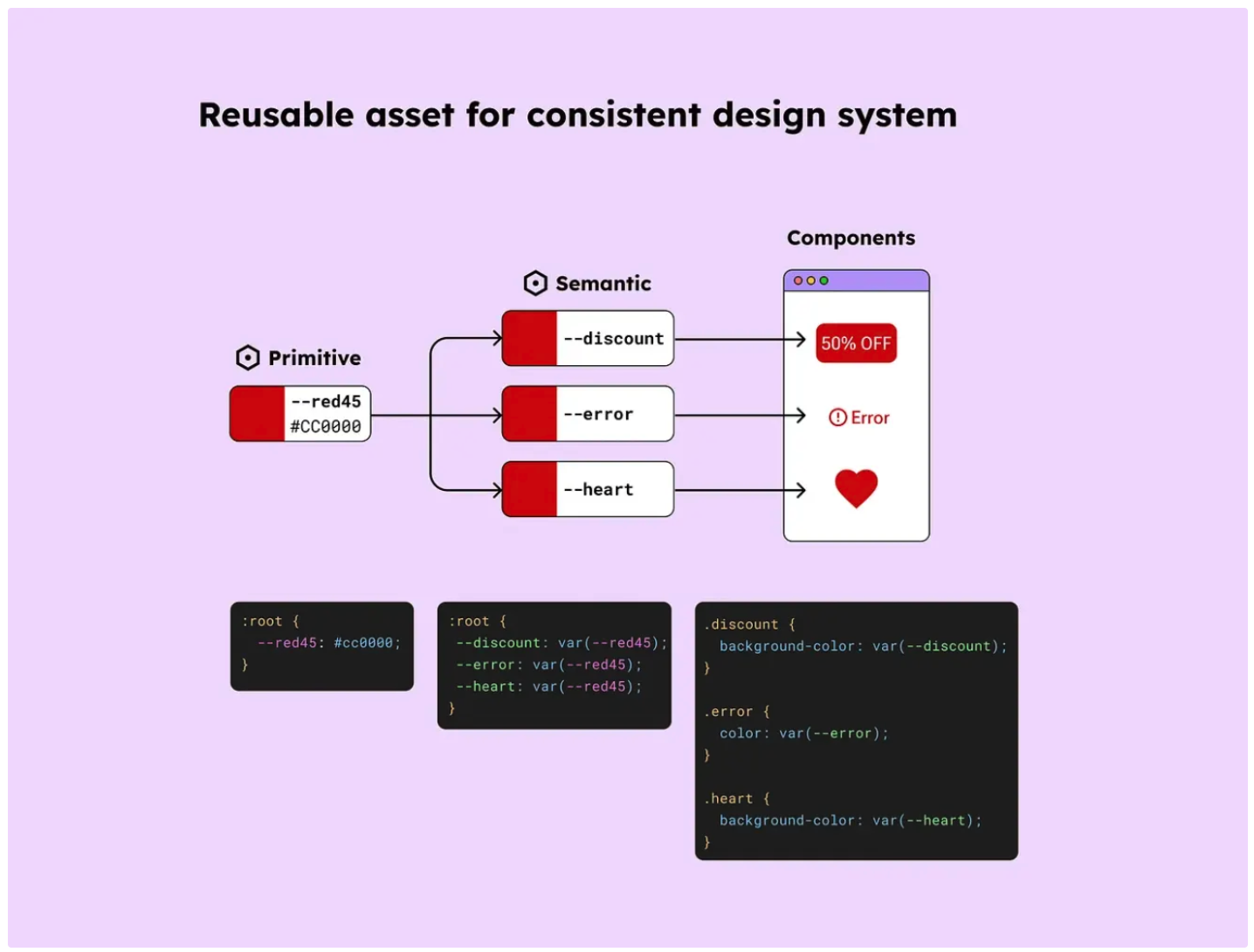
At the foundation was a primitive variable layer, which defines raw design values such as base colors, spacing units, and corner radius.
On top of that sat a semantic variable layer, which maps those primitive values to meaningful roles—such as primary button background static, or error state text color. Components reference these semantic variables rather than raw values, allowing visual changes (like theming or rebranding) without touching individual components.
Text styles were applied consistently across components, ensuring typography updates could cascade predictably throughout the system.
To align with the Strapi CMS's brand styling inputs, we created variables that directly map to what users can control in the CMS. We started with two themes to validate the approach.
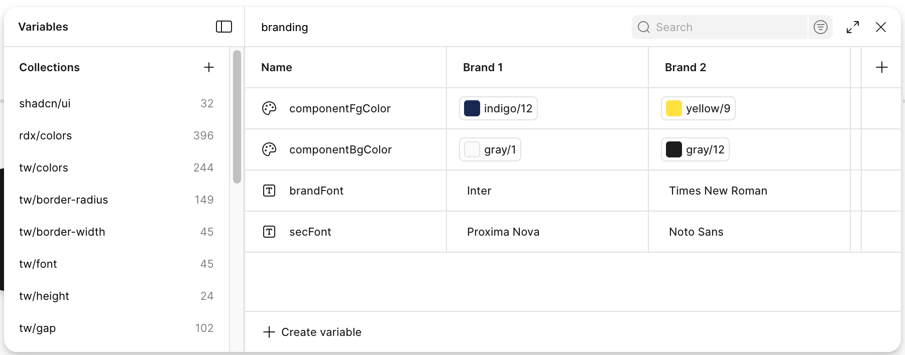
All components were designed to default to the system font, which we mapped to the secondary brand font. This ensured strong readability for core UI elements. Because every component references a shared set of text styles, linking those styles to the secBrandFont variable enabled global typography updates without touching individual components.
This structure translated directly into the build. The same secBrandFont token was exposed in code and wired to the theme configuration, allowing client managers to update fonts in Strapi while developers simply consumed the token. As a result, design intent, Figma variables, and production styles stayed tightly aligned.
The primary brand font is intentionally limited to high-impact moments:
We created dedicated components and text styles for these cases and linked them to a brandFont variable. This keeps the interface readable while still expressing brand identity where it matters most.
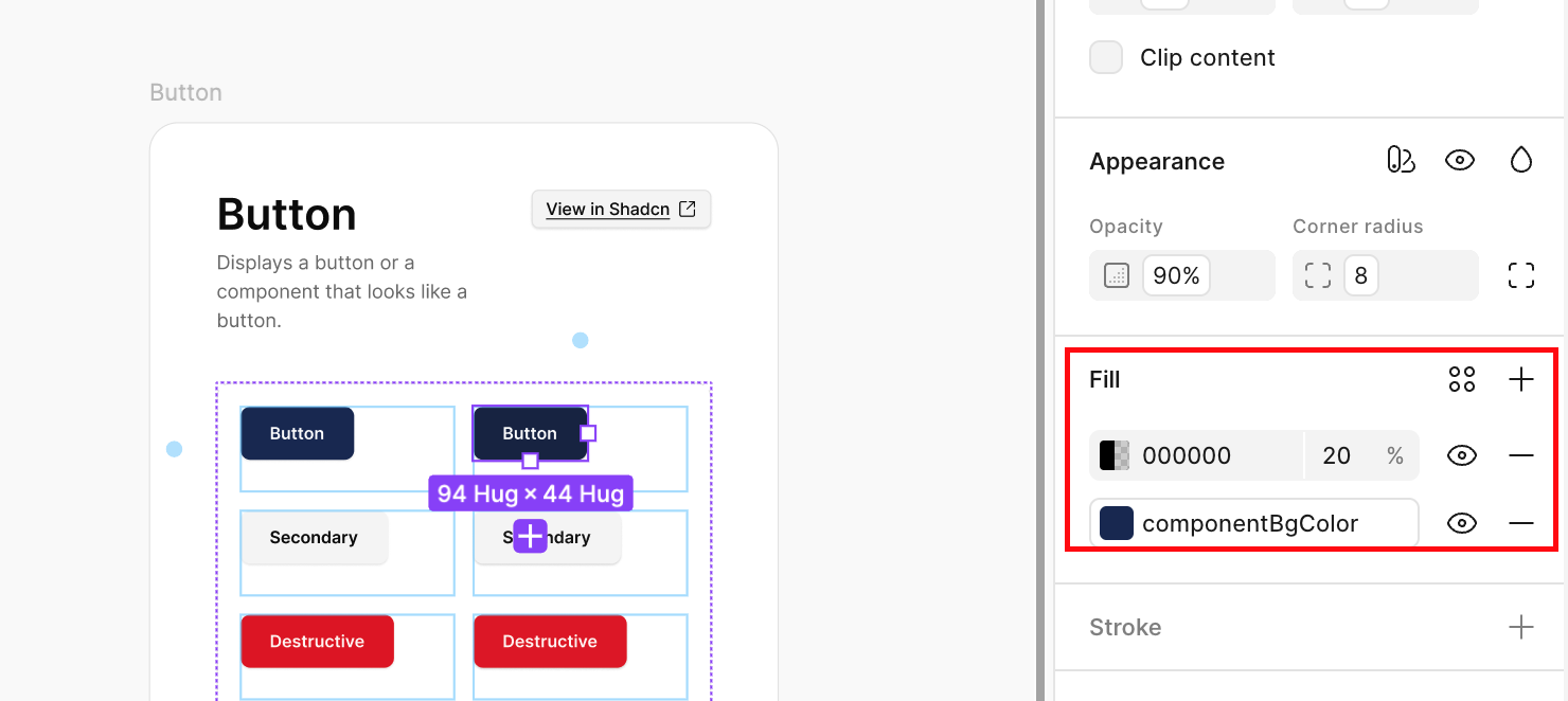
Next, we audited which components should respond to brand color, being intentional about where branding added value and where it could introduce noise. To preserve clarity, accessibility, and visual hierarchy, many neutral UI elements remained system-colored.
Brand colors were applied selectively to high-signal, interactive elements such as primary buttons, checkbox and radio selections. In contrast, inputs such as text fields, helper text, and error states remained consistent across brands.
Component fills and foregrounds were linked directly to brand color variables. Instead of introducing multiple color inputs for interaction states, we used overlays for pressed states, allowing visual feedback without increasing configuration complexity.
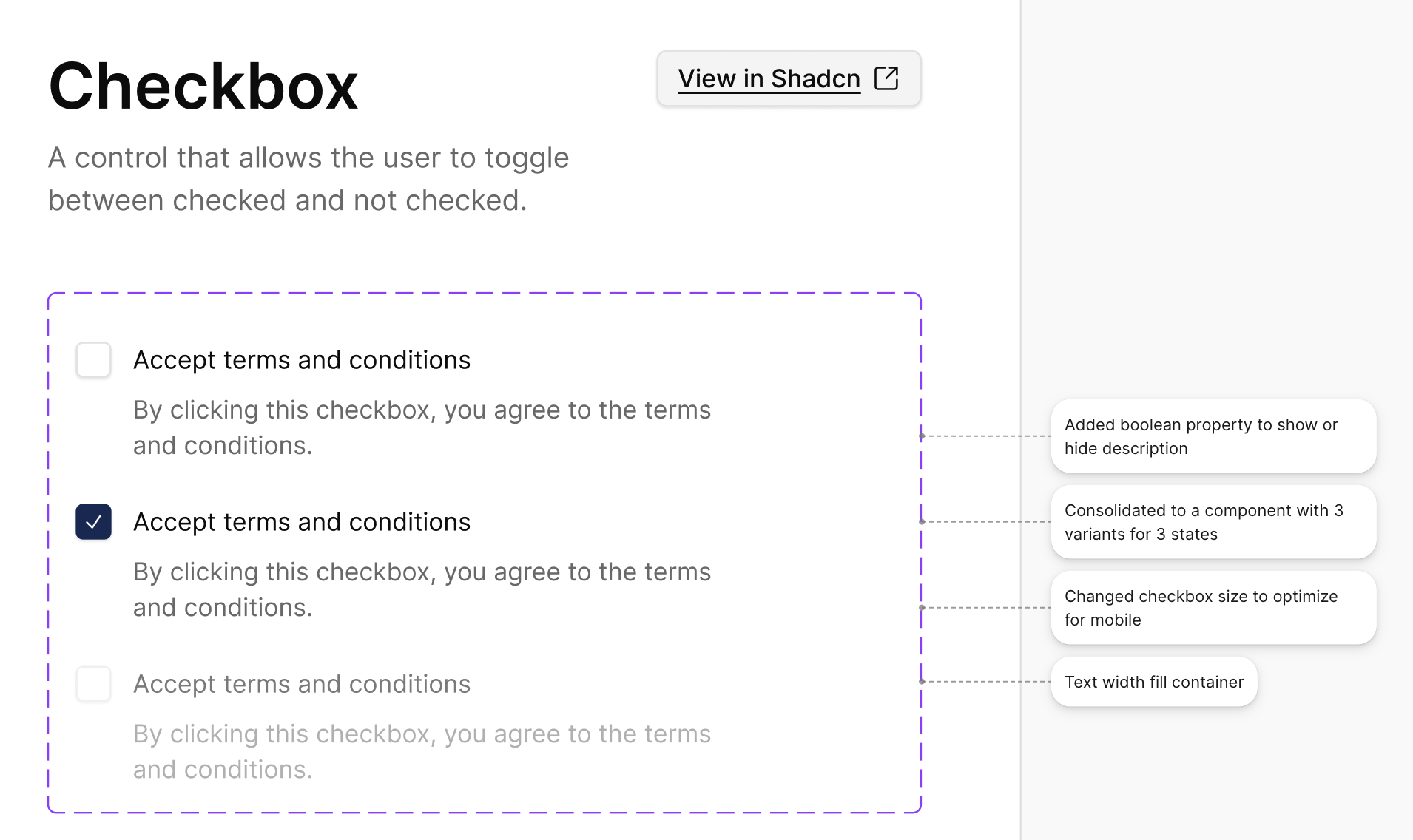
All components were adjusted for mobile scale optimization. Throughout this step, annotations were added for developers to explain intent, where visual tweaks needed to be reflected in code.
This step was critical since developers would be modifying the components directly.
Finally, we assembled full flows using only system components and tested theme switching across multiple brand configurations. Because all styling decisions flowed through variables, themes could be swapped instantly without breaking layouts or interactions.
This project reinforced a key lesson: design systems don’t need to be heavy to be powerful.
By pairing shadcn/ui with a clear variable strategy and disciplined component usage, we delivered a system that enables rapid theming and high-fidelity design while accounting for real-world product constraints without slowing teams down.
If you’re balancing speed, customization, and maintainability, a lightweight, production-ready system might be exactly what you need.
Working through something similar? Feel free to reach out - we love talking through design system strategies and patterns that have worked well in practice.


