They say a picture is worth a thousand words. Effective data visualization can communicate a vast amount of information at a glance. Edward Tufte, often called the “father of information design”, showed in his book, The Visual Display of Quantitative Information, that a poorly designed graph can mislead, while a well-designed one can reveal game-changing insights. His principles of clarity, context, and honesty are even more vital now, as the explosion of AI floods us with information, and digital dashboards and reports guide major decision-making.
In this post, we’ll translate Tufte’s theories into practical product design advice. Along the way, we’ll revisit a few of Tufte’s favorite historical examples and see how their lessons apply to our design decisions. Whether you are the creator or consumer of graphs and charts, these timeless fundamentals will help you elevate your digital data UX in meaningful ways.

Tufte’s core principle, “Above all else show the data,” underscores that a designer’s primary job is to let information itself shine. He introduces the data-ink ratio (the proportion of ink devoted to data versus total visual elements) as a way to measure clarity. Practical steps include avoiding background images, 3D effects, and other embellishments that compete with the data. Tufte highlights the dangers of overly stylized charts, warning that such gimmicks may attract attention but undermine comprehension.
However, many practitioners have pointed out that Tufte’s minimalist ethos can feel overly rigid in real-world contexts. His drive to eliminate all “chartjunk” (anything not directly representing data) produced a clean ideal, but sometimes at the cost of engagement. Critics such as UX designer Laurian Vega describe the approach as “dated and draconian,” likening a quintessential Tufte graphic to “all function and little form.” Even admirers like Stephen Few and Michael Gleicher warn against treating Tufte’s rules as dogma, noting that subtle visual cues or illustration can be benign or even helpful if they support comprehension.
For modern UX teams, the takeaway is to create visualizations where almost every pixel communicates data. This doesn’t mean a dull interface but rather one where visual emphasis stays on the content, allowing users to instantly grasp trends, outliers, and comparisons without wading through clutter. Tufte would say design the information first, before worrying about the polish. This aligns with a user-centered approach: figure out what the user needs to see to understand the situation, then build the UI around that.
One surprising takeaway from Tufte’s book is that more data isn’t necessarily a bad thing in a visualization – as long as it’s organized well. He argues that our eyes and brains are capable of processing a large amount of information if presented clearly. In other words, don’t dumb down your data visuals. Tufte actually encourages high data density: showing many data points or even multiple dimensions of data in the same graphic, if it helps reveal patterns and provide context.
This runs counter to an instinct some designers have that “simpler is always better.” Simplicity can be too simple – the classic example being an “executive summary” chart that shows only three big numbers, with one of them being the sum of the other two. Such extreme oversimplification borders on the trivial (and can insult the viewer’s intelligence). Tufte would rather see a rich, detailed chart that challenges the viewer to find insights than a hollow graphic with no substance.
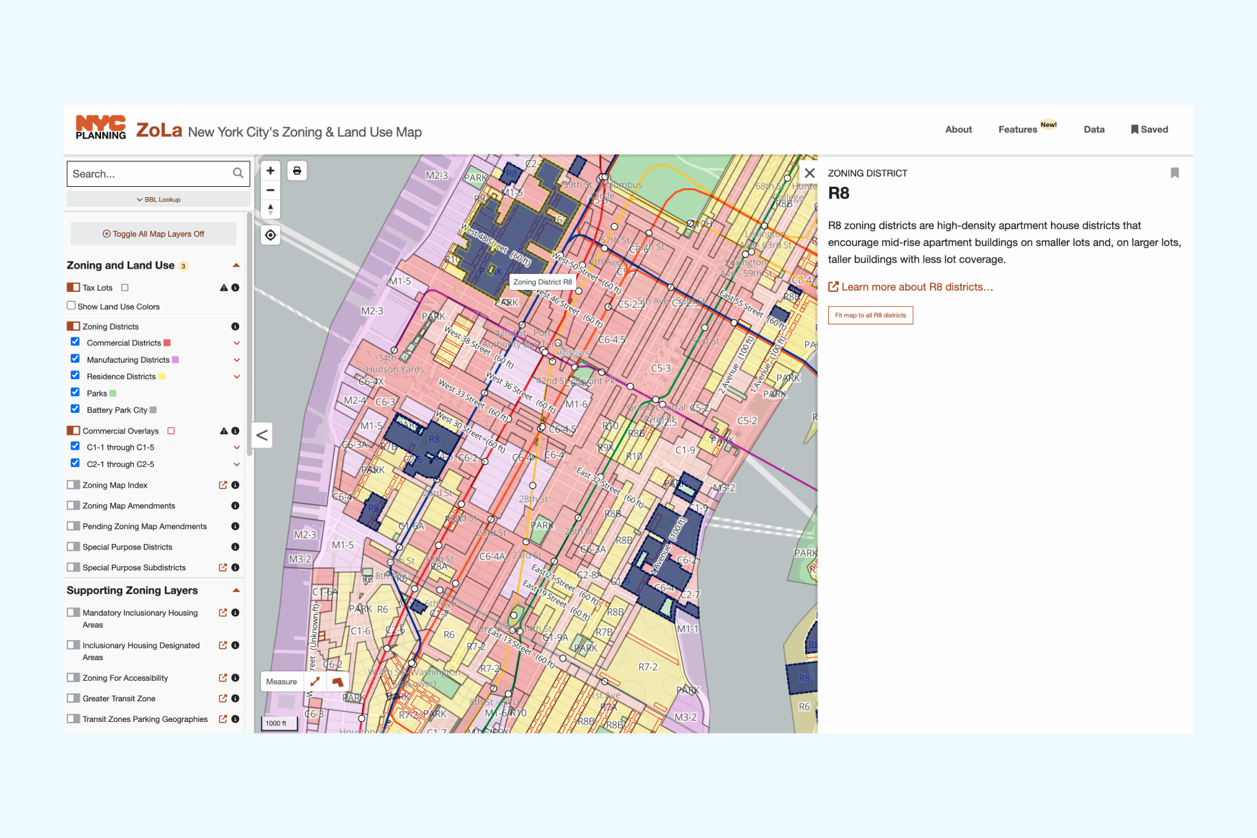
While Tufte’s call for high data density is inspiring, it can underestimate differences in cognitive load among audiences. Not everyone has the time, expertise, or motivation to decode an extremely info-heavy chart at once. Modern digital products like New York City’s interactive zoning map, Zola, show how this challenge can be handled differently. Zola uses tooltips, toggles, and info side panels that open on click to progressively disclose information. Users can start with a clear base map of zoning districts, then choose to reveal special-purpose areas or mandatory inclusionary housing areas based on their needs. They can also learn more about the definition of each type of zoning district via a link to another page if that’s what they are interested in. This approach maintains the richness of the underlying data while preventing overload, allowing power users to explore deeply and casual viewers to stay oriented.
One reason Tufte adored historical graphics is that many of them weren’t just analytical; they told a story. Perhaps the most famous example from his book is Charles Minard’s map of Napoleon’s 1812 Russia campaign. Tufte referred to Minard’s 1869 graphic as “probably the best statistical graphic ever drawn”. This single map weaves together multiple data streams into a narrative of tragic loss: the size of Napoleon’s army (waning as they marched), the path through the geography, the bitter temperatures on the return trek, and dates and locations of major events. It’s an early masterpiece of multivariate data visualization and remains a touchstone for how visuals can tell a compelling story.

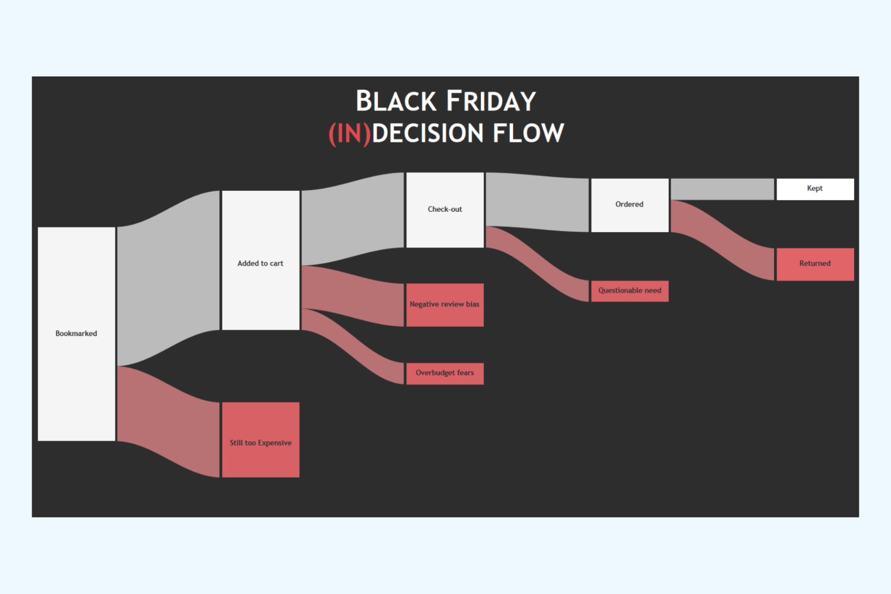
Modern Sankey diagrams carry this inspiration forward in a standardized form, with each node representing a stage and the width of each connecting link showing how much flows from one stage to the next. The “Black Friday (In)Decision Flow” graphic, for example, visualizes an e-commerce journey while surfacing the reasons for drop-offs at different stages. It clearly echoes Minard’s map by reminding us that the most powerful data visuals do more than display numbers — they show how data unfolds over time and what external factors shape it.
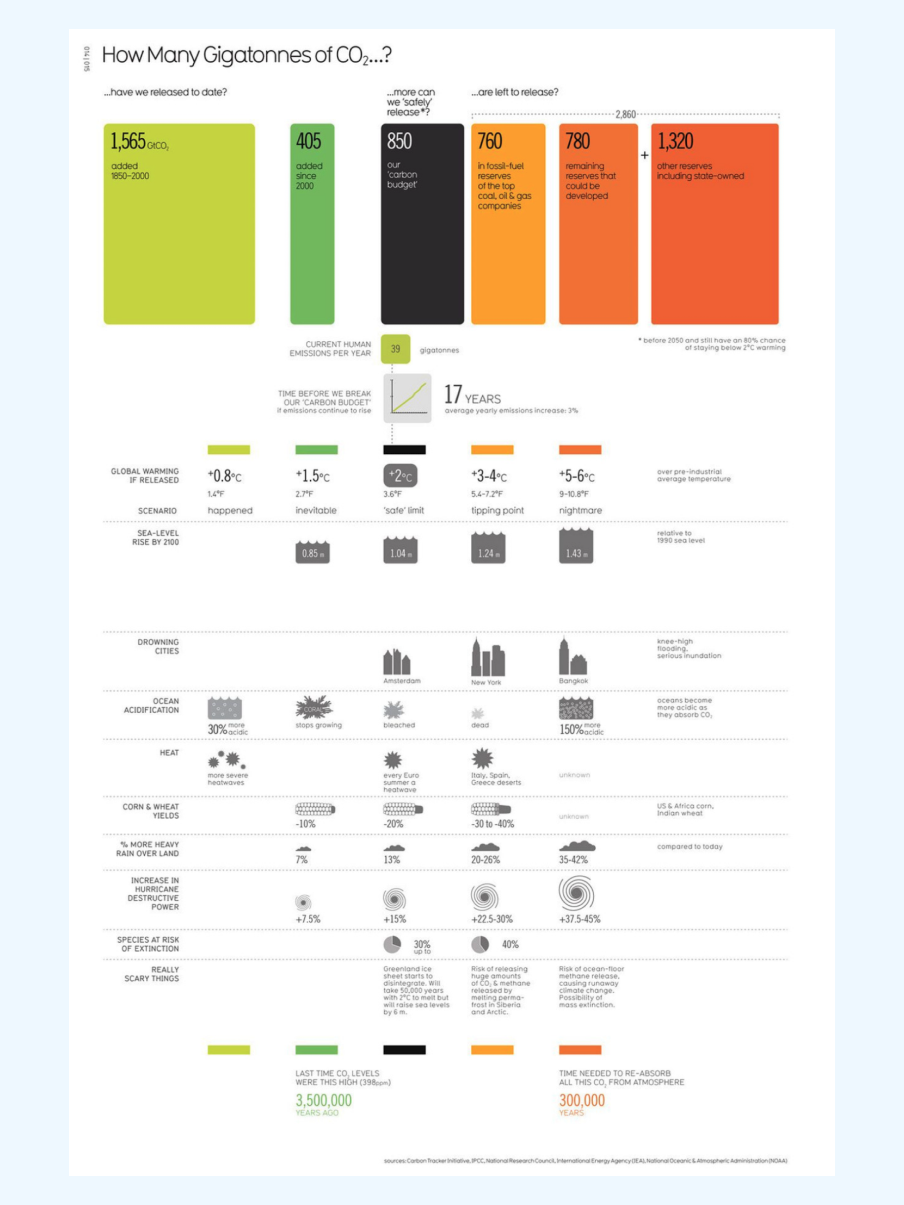
The CO₂ emissions graphic above is another strong contemporary example of this storytelling approach. It layers history, future scenarios, and consequences into one cohesive view. Past emissions are shown alongside current trajectories and remaining carbon budgets, while icons and color coding link each scenario to real-world impacts—melting ice, ocean acidification, crop yield changes, species extinction risk. This design lets the viewer trace not only how much CO₂ has been emitted or remains but also what it means for ecosystems and human life at each stage. Like Minard’s map, it transforms abstract data into a narrative arc that is memorable, visceral, and easy to contextualize.
Tufte stresses that integrity is the foundation of good data visualization. A beautiful chart is worthless, or even harmful, if it distorts the truth. He warns that many people already associate statistics with “lies,” so designers must work to earn and keep trust. His key rule is that the Lie Factor (the ratio of visual change to actual data change) should be 1.
Honesty also depends on context. Axes with units, baselines, and benchmarks help prevent misleading impressions. Good design anticipates the viewer’s questions—“compared to what?” “out of how much?”—and answers them within a graphic. Tufte encourages showing complete data when possible, such as full time sequences or small multiples (a series of similar, small charts arranged in a grid, each displaying a different subset of data while using the same scale and axes for easy comparison), to signal transparency and avoid cherry-picking.
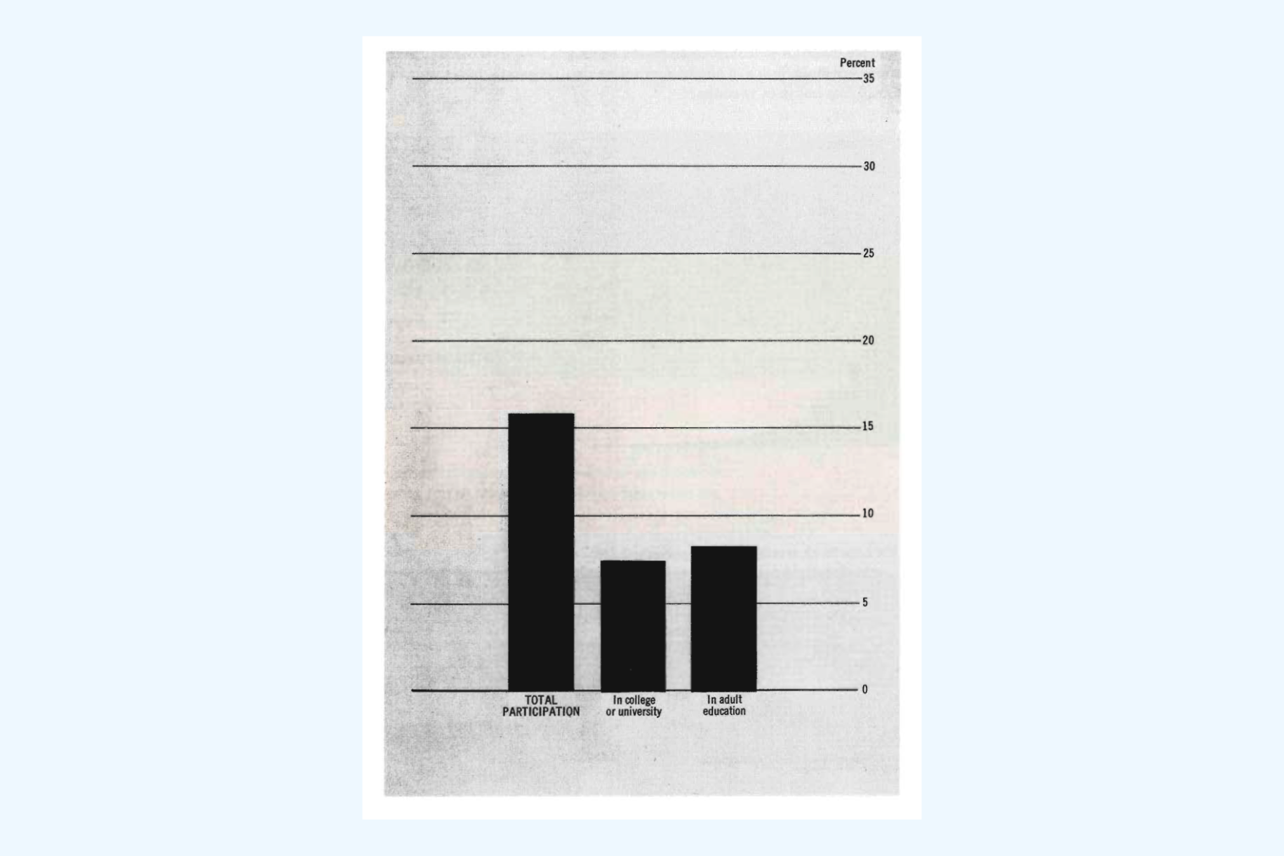
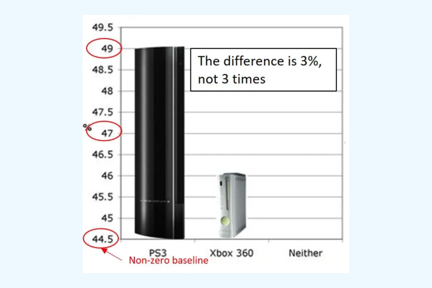
An example of breaking this rule is a chart with a non-zero baseline. This chart comparing the popularity of PS3 and Xbox 360 starts the y-axis at 44.5% instead of 0%. Visually, the PS3 bar looks about three times taller than the Xbox bar, even though the actual difference is only a mere three percentage points.
Finally, Tufte ties beauty to truthfulness, noting that clarity itself is beautiful. Designers should take pride in making information sing without sacrificing accuracy, double-checking labels, scales, and data sources. Integrity isn’t just a data team responsibility; it’s a core design duty to present information faithfully and transparently.
Tufte’s principles are not relics of print graphics; they’re a living framework for the age of digital dashboards, automated analytics, and endless data streams. By focusing on the data above all, eliminating distractions, embracing rich details in a user-comprehensible way, and insisting on honesty, we can build visualizations that are both information-rich and approachable.
Understanding concepts like the importance of baselines, the power of context, and the Lie Factor helps you spot misleading visuals and extract the insights that truly matter.
Tufte’s call for clear, truthful, and richly informative graphics has only grown more relevant. By applying his principles and tempering them with modern interactivity and empathy for your audience, you can design or interpret visuals that not only look good but genuinely improve decisions, build trust, and create impact.