The small dip in sidewalks, originally made for wheelchair users, now helps families with strollers, travelers with luggage, and many more. This phenomenon, the Curb Cut effect, is an example of how inclusive design can benefit more people than just those it was intended to. For UX designers, this metaphor becomes a mindset, focusing on inclusivity and enabling solutions that enhance the experiences for all users.
Explore how the Curb Cut effect reshapes digital design, why focusing on accessibility fosters innovation, and how embracing these cases can lead to smarter, more intuitive products.

Key examples of accessibility features that improve usability for a wide range of users are voice controls, high contrast mode, and closed captions.
Voice control, initially created for users with motor impairments, became increasingly popular for hands-free operation. Now users can speed up usability or ensure safety when using interfaces, like when cooking or driving. Voice control has also become popular for automation, with many users now integrating voice controls into their smart homes to speed up their daily interactions.
Originally created as an accessibility feature to improve readability for users with visual impairments, high contrast mode is another example of the curb cut effect in digital design. By using simple backgrounds and bolder colors, which reduce visual clutter, this feature provides support for users without visual impairments by helping with focus and reducing eye strain.
Closed captions, that were originally created for d/Deaf or hard of hearing users, are now used widely by all users. Whether in a noisy environment like public transport, trying to learn a new language, or just having a preference for it, closed captions have influenced video consumption and aid comprehension.
To learn more about accessibility features and their benefits, check out another one of Perpetual’s posts, Perks of Improving Your Digital Product’s Accessibility.

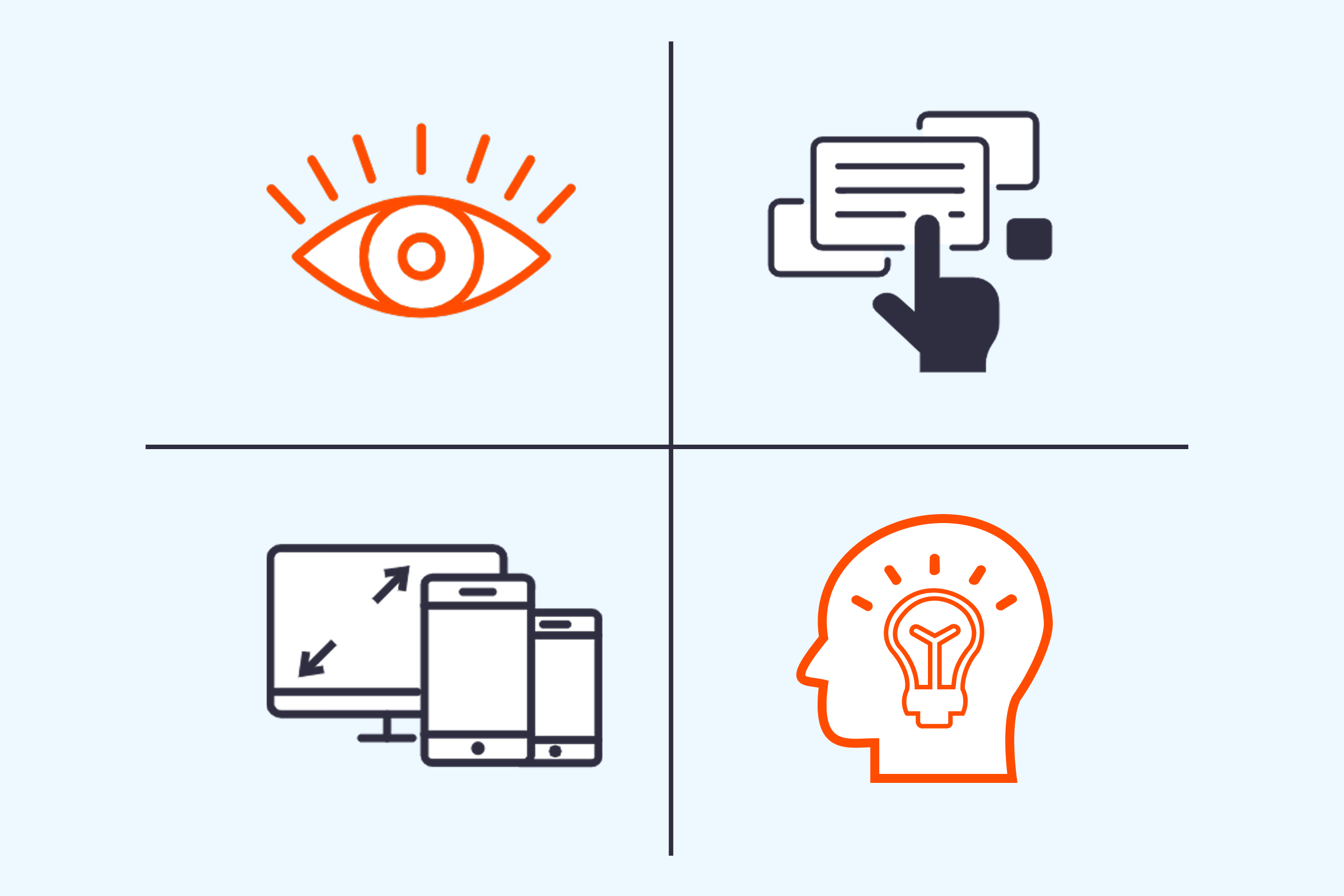
The Curb Cut effect explains how accessibility features benefit all users and the POUR principles help guide designers to create accessible experiences. These principles are a framework developed by the W3C (World Wide Web Consortium) to guide accessible digital design. When designers apply these principles, they create a groundwork for innovations that benefit broader audiences.
The principles connect to real curb-cut examples and have significance beyond accessibility.
This principle explains that information and user interfaces should be presented in ways users can perceive, like through sight, sound, or touch.
We see this principle in features like voice control and closed captions. They utilize sound and text so information can be perceived by a greater number of users. These features help individuals who have visual or hearing impairments, but also encourage multi-tasking and receiving information in different settings, making information more universally accessible.
The operable principle suggests users should be able to navigate and interact with the interface, regardless of their input method.
Features like keyboard navigation utilize the operable principle. With this feature, users are able to move through and access information without the use of a mouse. This operable design enables users to interact and navigate through interfaces in varied methods, supporting not only users with motor impairments, but also allowing users to control how and when they interact with interfaces and navigate with greater speed and efficiency. Now users can efficiently use an interface whether they’re on a shaky commute, rely on screen readers, and/or have temporary limited movement.
This principle explains that content and controls should be clear, consistent, and predictable.
This accessibility principle encourages designers to implement clear text, layouts, and interactions into interfaces. This design guideline helps reduce cognitive load, supporting users with cognitive disabilities but it also supports new users and those who speak different languages. A good example of understandable design is interfaces that support multiple languages.
The robust principle encourages that the design should work across a wide range of devices, platforms, and technologies.
With robust designs, compatibility is expanded across devices and assistive technologies. This framework means designs can work in different use cases, like whether a user depends on a screen reader or has an older version of their device or browser. Creating robust designs not only supports accessibility, but ensures the longevity and adaptability of digital designs.
Rather than as constraints, UX designers can utilize this accessibility guide as a creative push. Embracing these principles and designing for different use cases encourages designers to be creative and develop smarter, more intuitive, and empathetic products.
The Curb Cut effect displays the impact of accessibility and how it can be used as a strategic advantage. When we design with inclusivity in mind, user experience is elevated. Features like voice control exemplify how accessible design can improve user satisfaction and retention by reducing friction in interactions. Accessible design can encourage users and designers to think outside the box and create new and profound methods of usability.
Want to build an inclusive digital experience? Our team is here to help, reach out today!