Microcopy, those concise snippets of text like button labels, error messages, or tooltips, is the unsung hero of SaaS platforms. Seamlessly woven into user interfaces, microcopy guides, reassures, and empowers users, transforming complex interactions into intuitive experiences. When crafted thoughtfully, it aligns with a brand’s voice, eliminates confusion, and drives conversions by making every click feel effortless.
In SaaS platforms, users need to make critical decisions, manage complex datasets, and often complete high-stakes tasks. Clear and unambiguous guiding content can make them feel confident in the actions they take. This post focuses on how UX microcopy can greatly enable an experience with actions, tooltips, and toast messages. Let us walk through examples and best practices for each of these.

When users are about to take an action—especially an irreversible one—microcopy plays a critical role in guiding decision making and preventing errors.
A modal, a window that appears on top of a page section or underlying content, is a prime location for microcopy to reinforce clarity. Best practices for modal microcopy involve confirming the action, clarifying the outcome, or offering an escape hatch.

Title: “Are you sure you want to delete this report?”
Body: “This action is permanent and cannot be undone.”
Buttons: Cancel | Delete report
Use modifiers like “permanently,” “from this team,” or “revoke access” to clarify scope and consequences.
Remove User or Delete User—Which one to use?
There’s a big difference between removing a user from a project and deleting their account entirely. Your microcopy must reflect that distinction.
Action labels like “Cancel,” “Back,” “Discard changes,” and “Undo” may seem interchangeable, but they serve distinct purposes. Using the incorrect term can confuse users, interrupt task flow, or even cause accidental data loss. Here is examples of the usage.
Use “Cancel” to exit a flow, “Back” to navigate, “Discard changes” to revert edits, and “Undo” to reverse a specific action—each label should match the user's mental model to avoid accidental loss.
A tooltip is a small, interactive UI element that appears when a user hovers over, clicks, or focuses on a specific part of a user interface. It provides brief, contextual information or guidance to help users understand the element’s purpose or functionality without cluttering the main interface. A well-placed tooltip reduces user uncertainty without cluttering the interface.
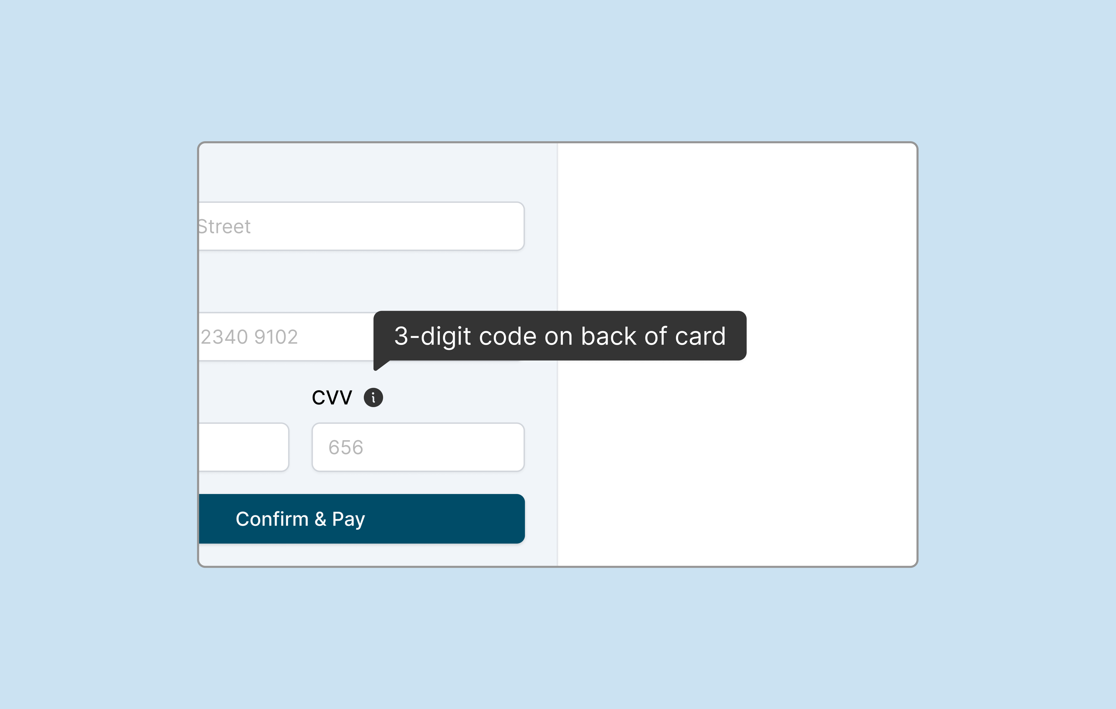
Field: “Billing Email”
Tooltip: “Invoices and payment confirmations will be sent here.”
Make tooltips informative to reduce the learning curve for users to achieve their goals.
A toast message (or simply "toast") is a brief, non-intrusive notification that appears temporarily on a user interface to inform users about an action’s status or a system update. Toast messages are quick, transient, and often overlooked—but they’re key to reinforcing feedback loops in SaaS. There are two types of toasts—with or without an action. Here are some examples:
Write toast messages like headlines—one sentence with a clear message and no guesswork.
From modals to tooltips to toast messages, microcopy steers behavior, reduces mistakes, and makes enterprise software feel human. At Perpetual, we create microcopy carefully as an integral part of the product experience from day one.
Want to learn more about best practices when designing SaaS platforms? Check out our posts “How to Design a Better SaaS User Management Experience” and “How to Design SaaS Onboarding Flows that Boost Adoption.”
Looking for a team to help you build SaaS platforms that bring clarity and confidence? Let’s connect.