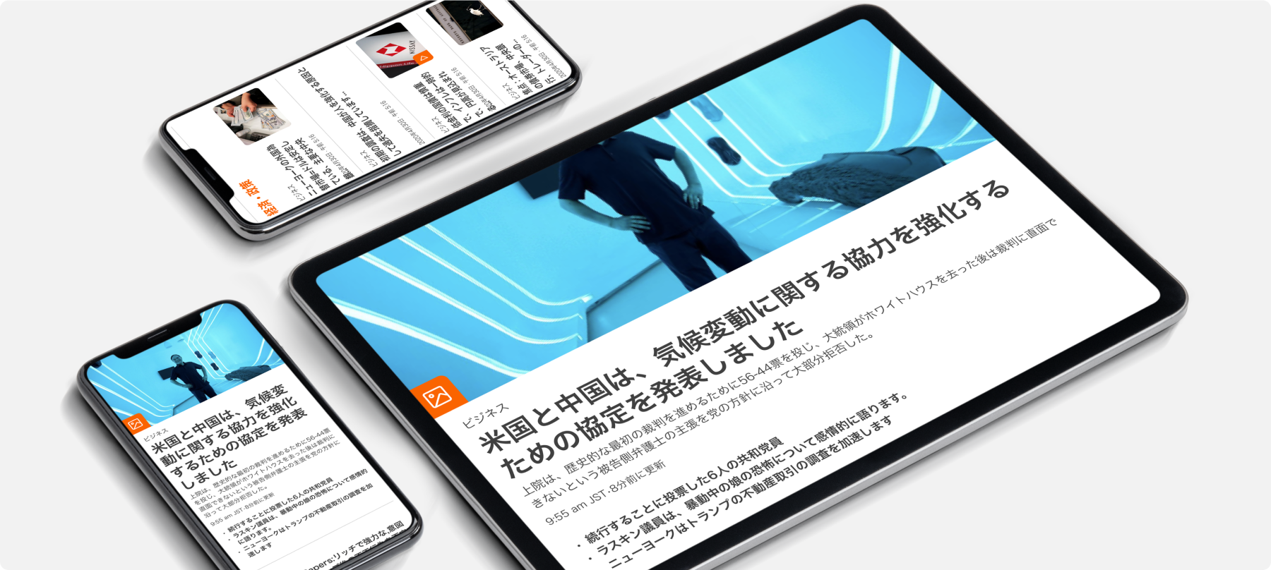

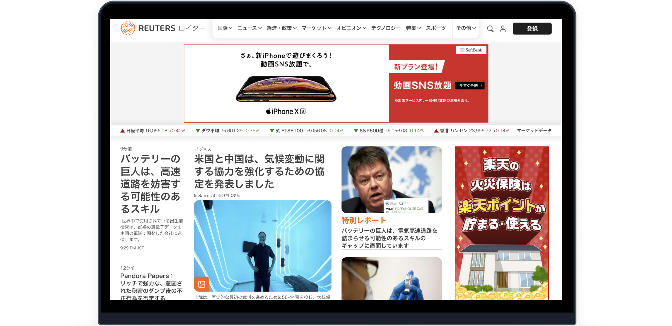
Reuters, the news and media division of Thomson Reuters, is the world’s largest multimedia news provider, providing business, financial, national, and international news to professionals all around the world. Reuters Japan is the Japanese version of Reuters, mainly catering to the Japanese audience.
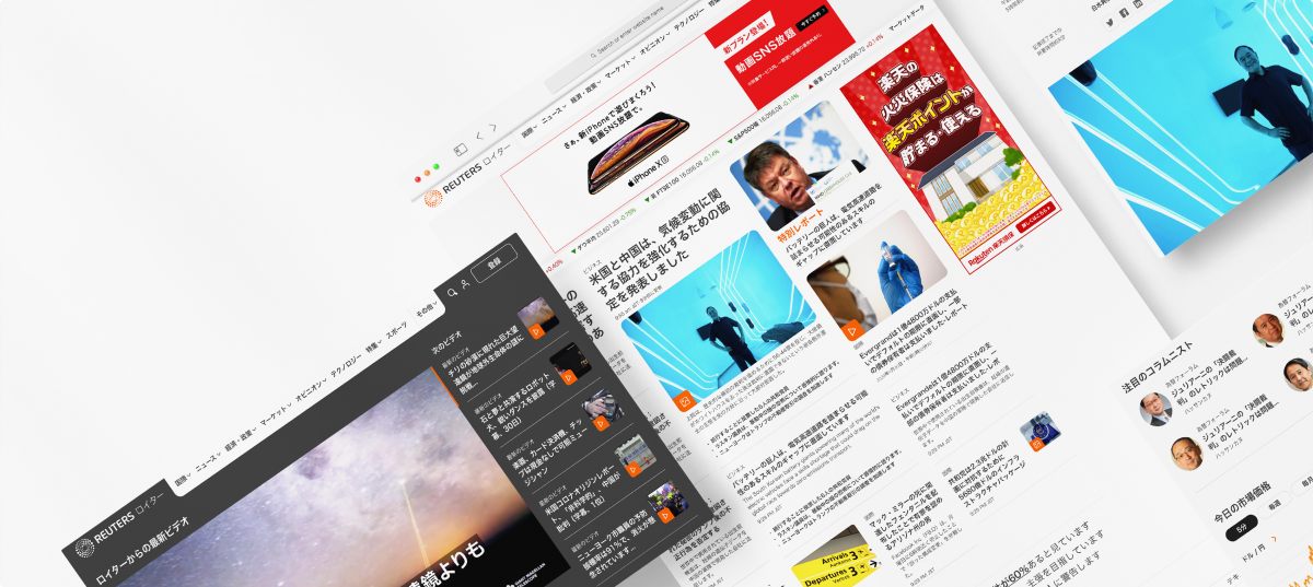
Reuters.com recently underwent a redesign, with the website built on a new design system. This project was to redesign the Reuters Japan website using the new design system. Custom components had to be built to facilitate market data and related content.
The high level, and on-page level of information architecture was also revisited, and the overall user experience was reconsidered, with enhancements targeting a Japanese-speaking audience.


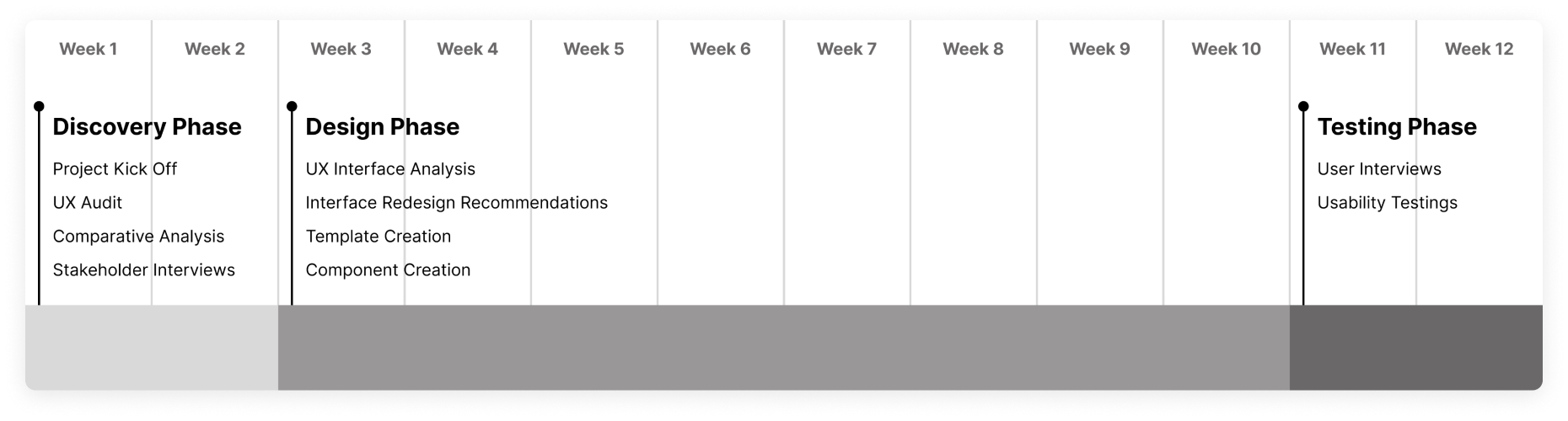
This project followed an agile methodology, with an initial UX Analysis, followed by Research Phase, Design Phase, the User Testing and Validation phase.
There were bi-weekly check-in meetings with the project stakeholders. Feedback was received on designs with the manager and their internal designers, and to ensure all requirements were addressed.
Upon completion of the project, a handoff documentation was created with details, documentation, and links to all activities and exercises involved throughout the product design process. Design specification documentation was also provided for the new custom components created for a seamless development transition.


Designing in dual languages simultaneously posed a unique challenge in this project since we are English speaking designers. We also need to consider the Japanese cultural elements in the design. By designing components and templates into variants, designers can easily switch components from the Japanese language version to the English language version.
The overall scale and short timeline of the project also posed a challenge. With 74 unique pages with their own unique content, across desktop, mobile, and tablet, the short timeline of approximately three months required a reusable, scalable, and durable approach, that was found in Atomic Design.
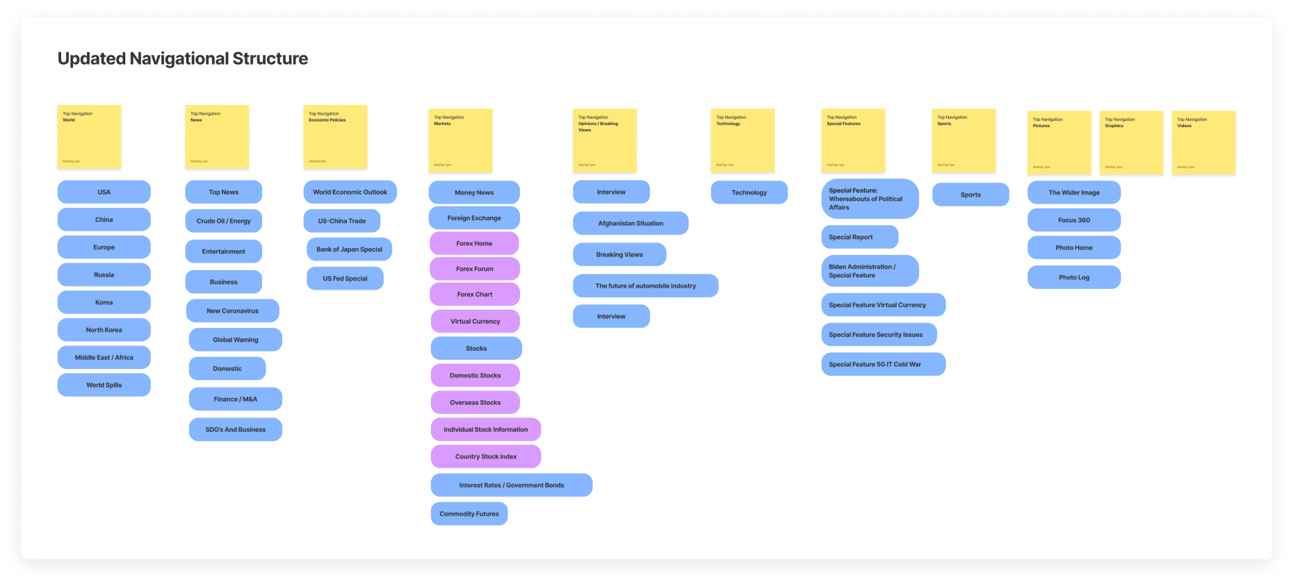
We evaluated the existing navigation structure of Reuters Japan and looked into ways to optimize the current experience. We started by capturing the existing navigation of Reuters Japan, and examining navigation of competitor sites, such as Nikkei, Yomiuri, and Yahoo. We developed a recommendation an improved version of information architecture for Reuters Japan.
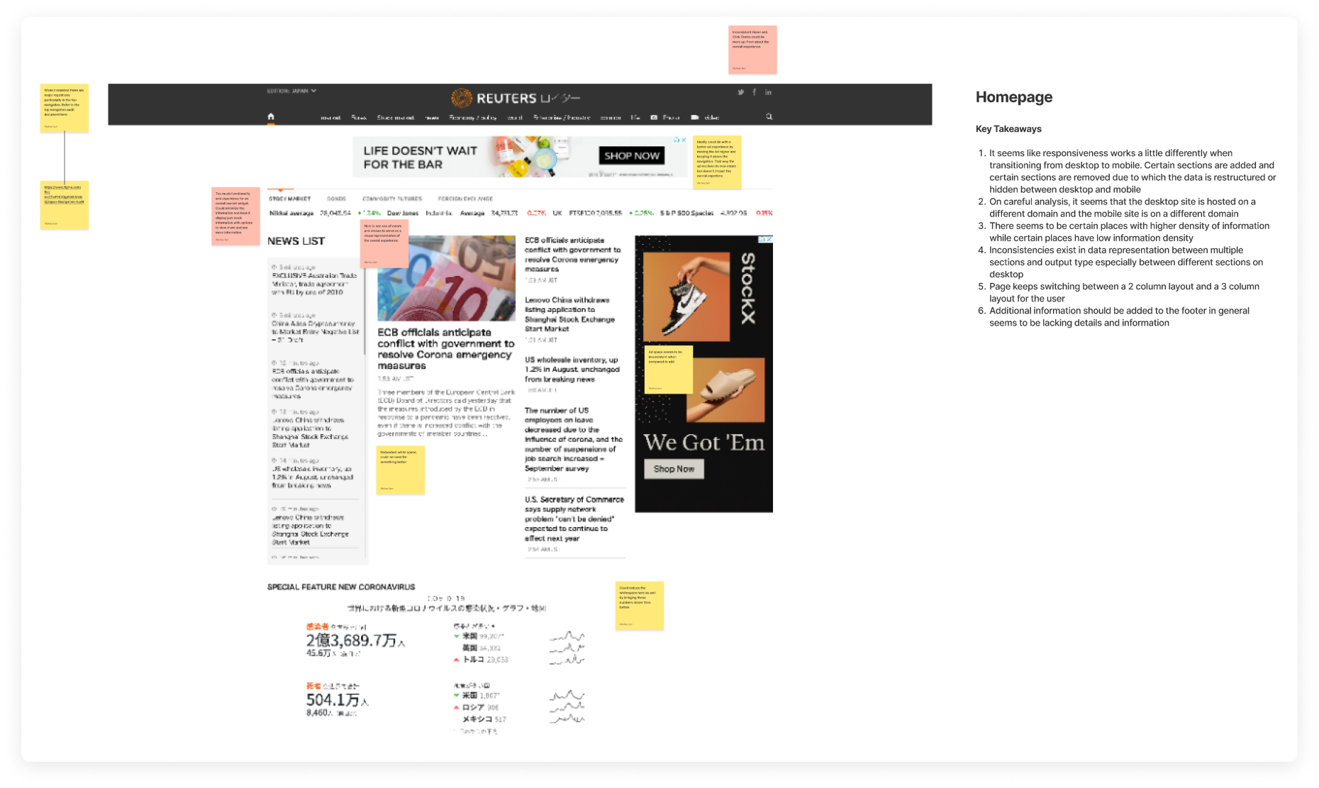
We got a better understanding of Reuters Japan’s offerings. We wanted to identify potential usability issues and pain points throughout the user journey. We created a FigJam Board to visually document the highs, lows, and neutrals on the Reuters Japan Platform - across Desktop, Tablet, and Mobile, along with a summary of key takeaways for more important pages.
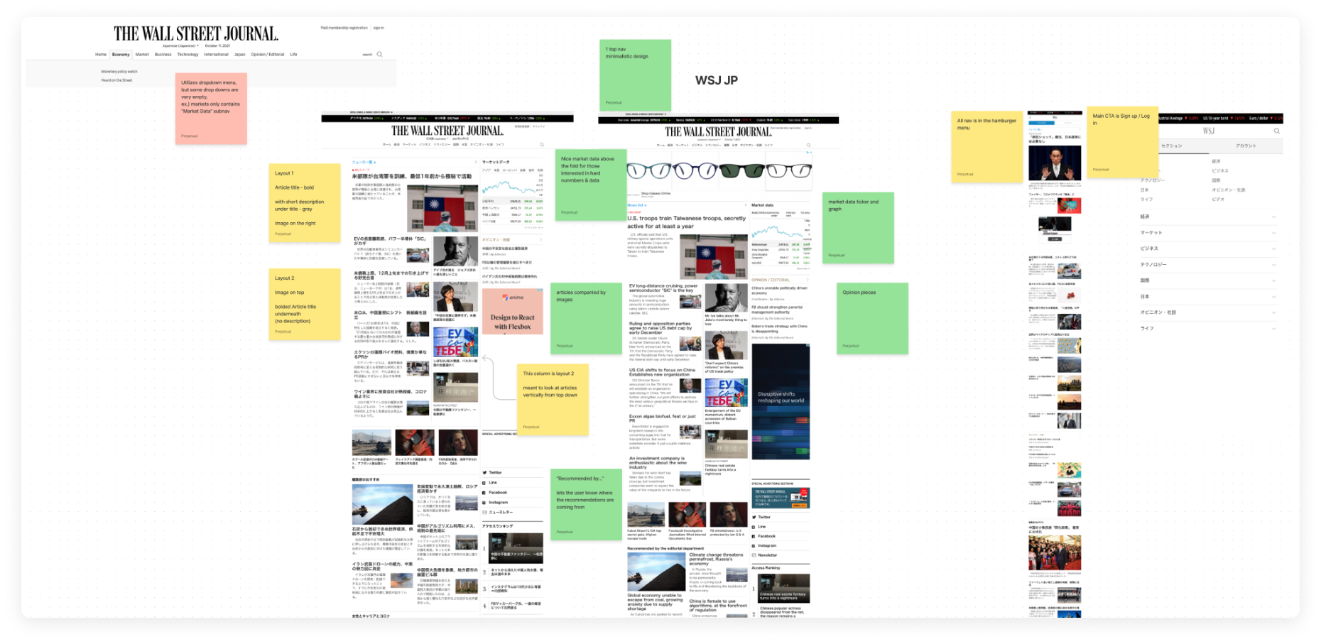
We gathered insights on competitor strengths and weaknesses and managed to understand Reuters Japan’s unique value proposition in the current market. Competitors included Wall Street Journal Japan, Nikkei, Yomiuri, Asahi, Yahoo Japan News, and Bloomberg Japan, across desktop, tablet, and mobile platforms.
We created a FigJam Board to compare the highs, lows, and neutrals of each of these competitors across multiple features and pages, including navigation, homepage, article page, video page, and more.
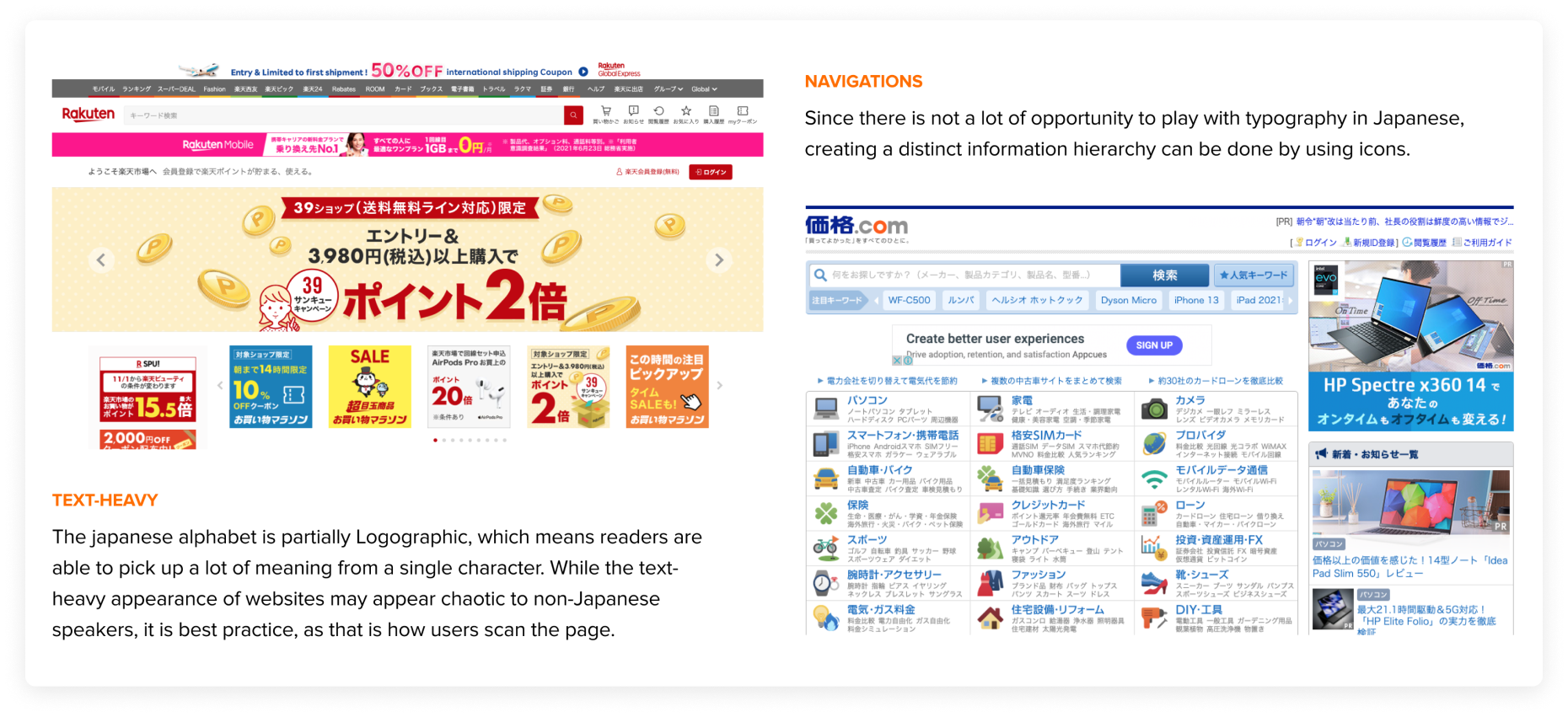
We researched to deepen our understanding of the Japanese user base and audience regarding differences in the culture and behaviors when consuming content. Elements analyzed in this study included typography, iconography, use of graphics and images, colors, cultural impacts, consumer behavior, technological preferences, and cultural context.
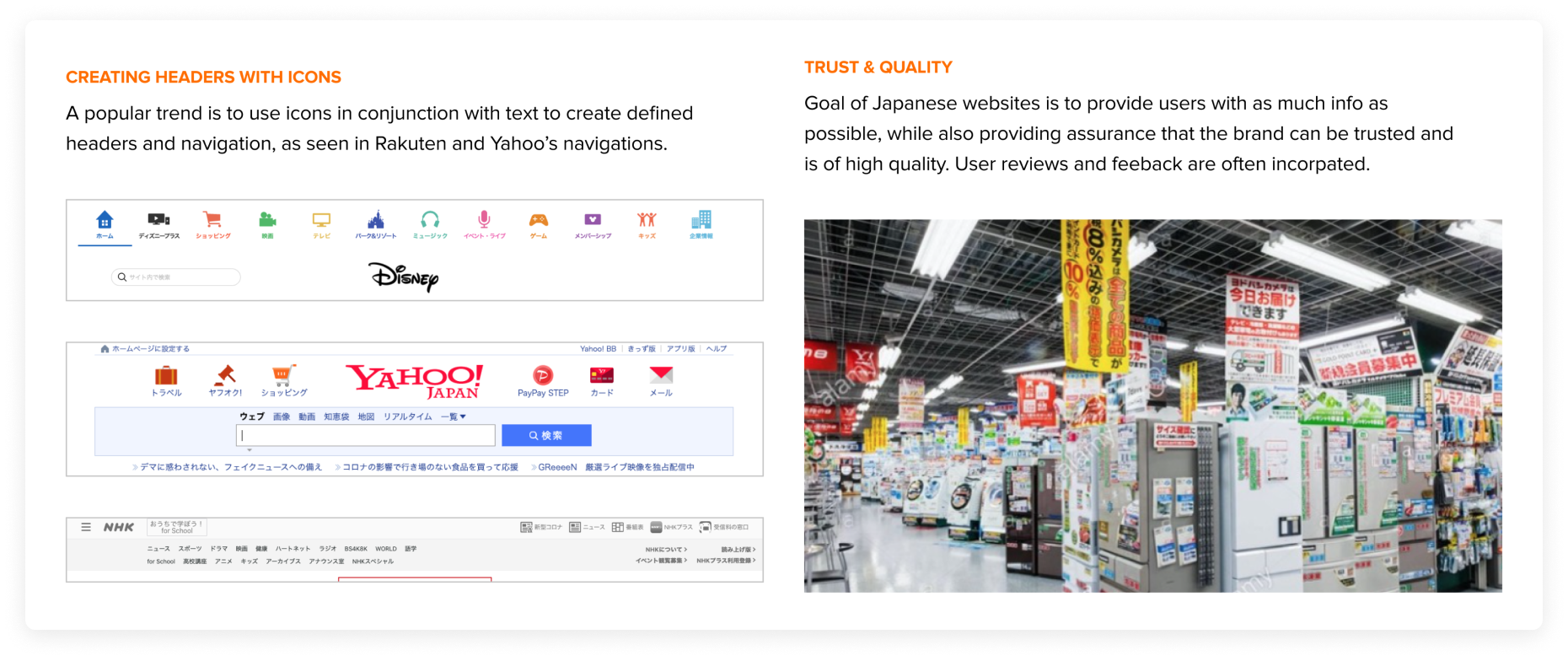
We researched and gathered a deeper understanding of what Japanese audiences expect and want to see regarding Web Design. From the Cultural Considerations Analysis, we developed a list of the best practices in Web design from a Japanese standpoint - focusing on responsiveness, information density, brand reputation, and the group mindset. Competitor examples showcasing these best practices, and how it applies to Reuters Japan were highlighted.
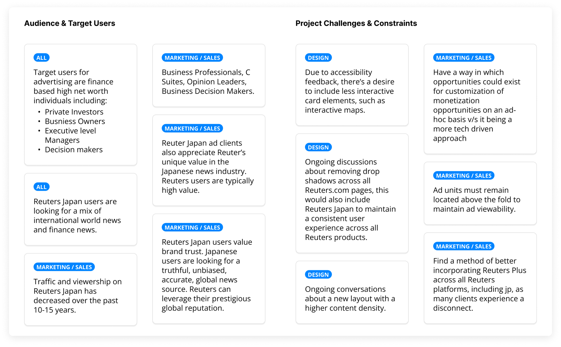
To improve usability and conversion rates of the site through understanding user data, we took a look at Google Analytics data review. The Analytics Review assists in prioritizing which devices, screen sizes, and pages to design.
We interviewed the stakeholders to understand the specific needs of different parts of the business. One-on-one semi-structured interviews were conducted over Microsoft Teams with stakeholders across multiple departments - including Tech, Sales, Editorial, and Product. We uncovered additional pain points and project opinions that various stakeholders had from these interviews.
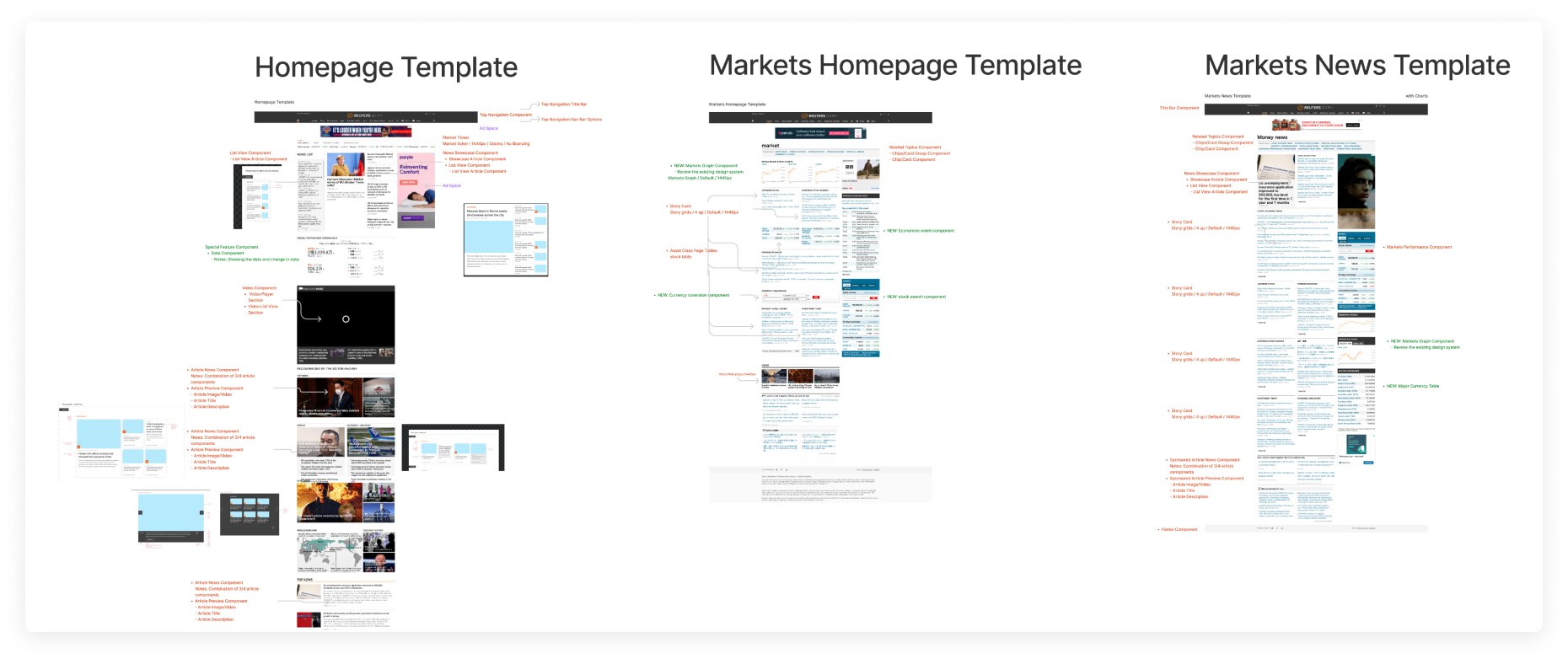
The analysis was done to understand which components existed within the Reuters.com design library that could be used for the Reuters Japan redesign. This process would allow designs to be consistent with other Reuters products. It would also allow us to save time and resources during the design process.
Using FigJam, component inventory was documented from individual pages with descriptions and design details, noting whether the component exists within the design library or if it would be a Reuters Japan-specific component.
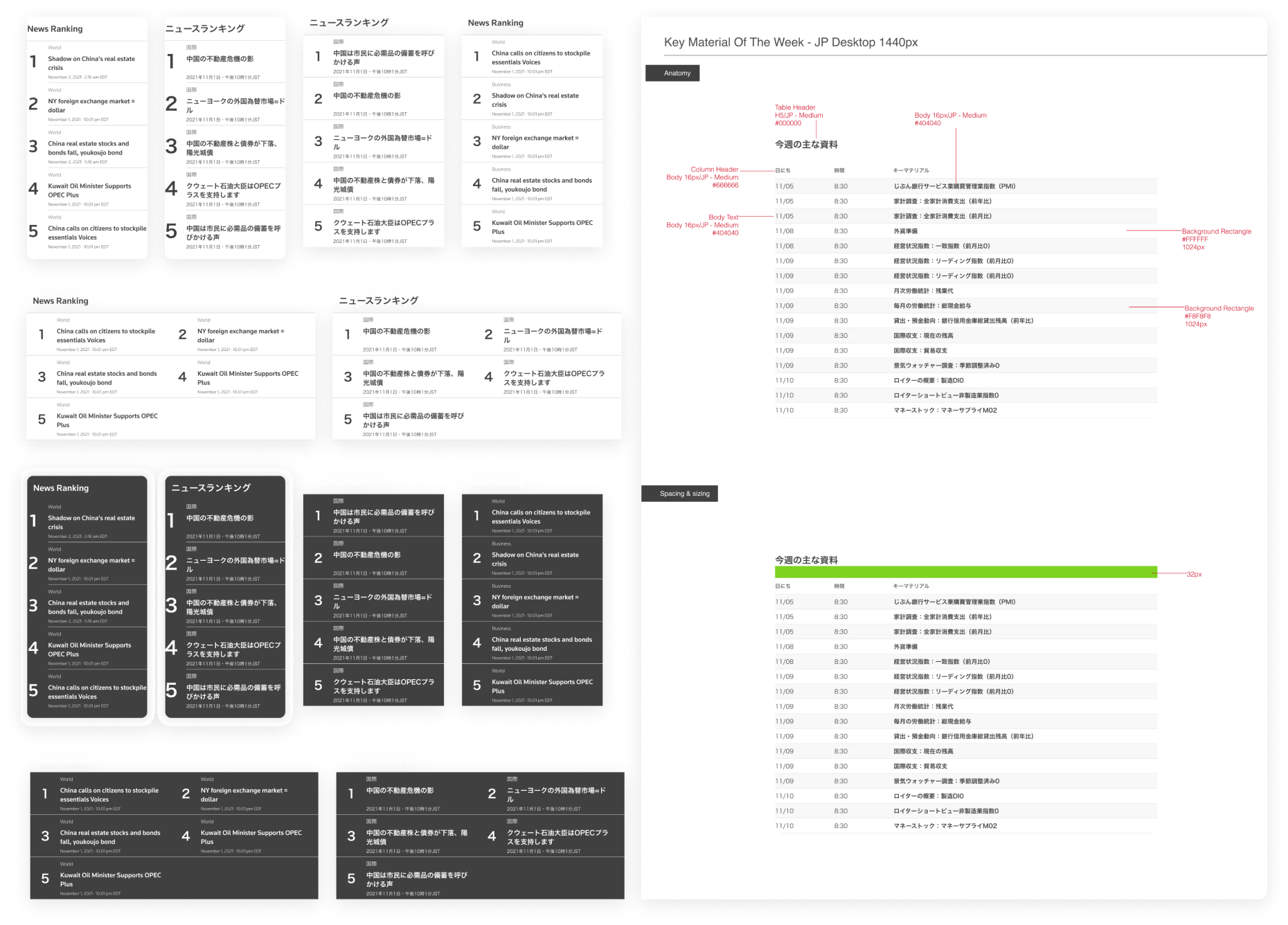
We created new, unique components for Reuters Japan, that were later also added to the Reuters.com Design Library. These components were created to specifically supplement content for the Japanese audience. Examples of components include the Ranking component and the Currency Conversion component.
The Existing Component Analysis yielded a list of components that were marked as not existing within the Reuters.com Design Library. These new components were created in Figma, along with their corresponding design documentation.
We took an Atomic Design approach for this project. Instead of creating 73 unique pages, we created 17 reusable templates to accommodate all of the current content on the site. The templates were created as multi-lingual variants, with the ability to toggle between English and Japanese. This design method promotes scalability and efficiency, while saving time and development resources.
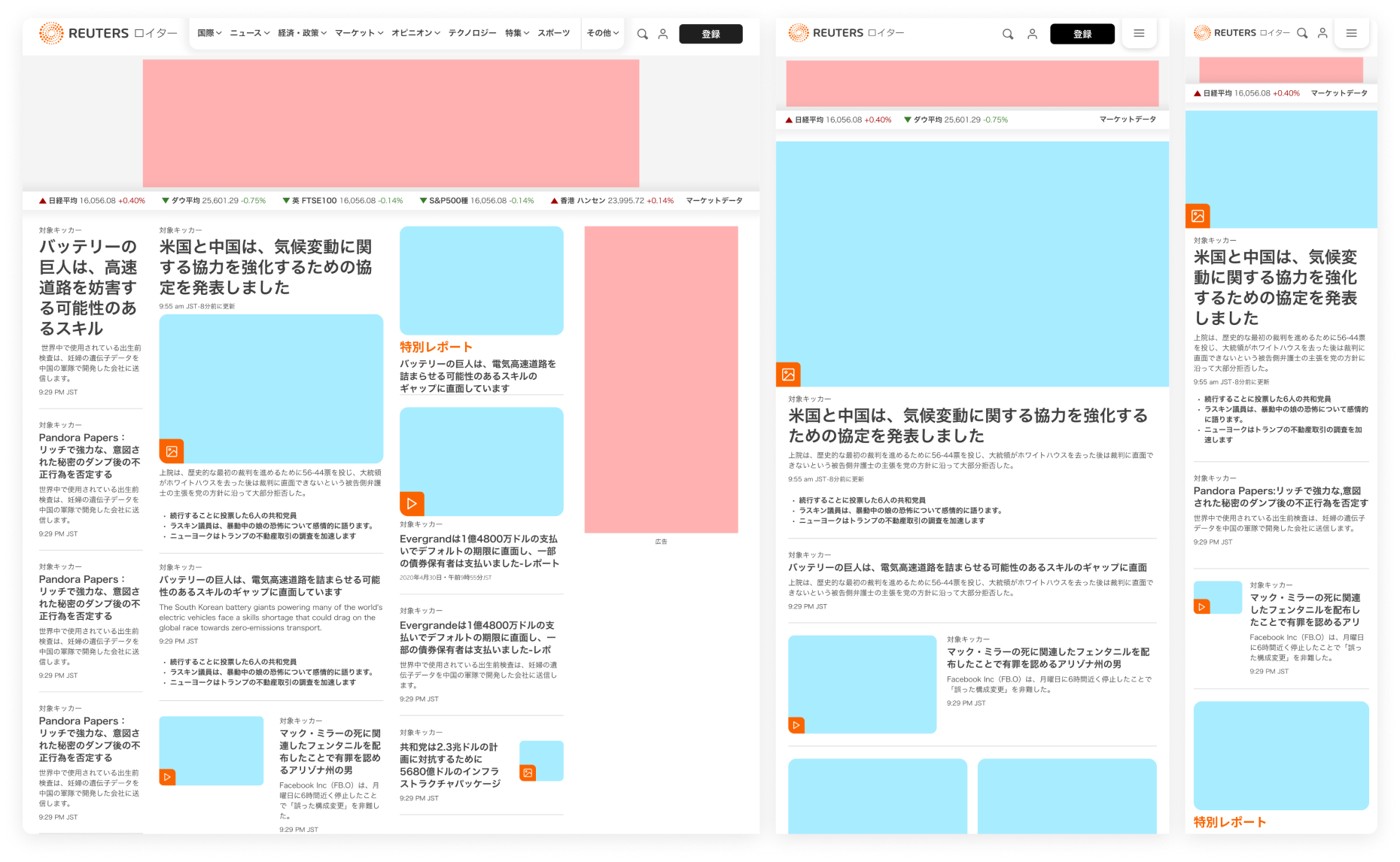
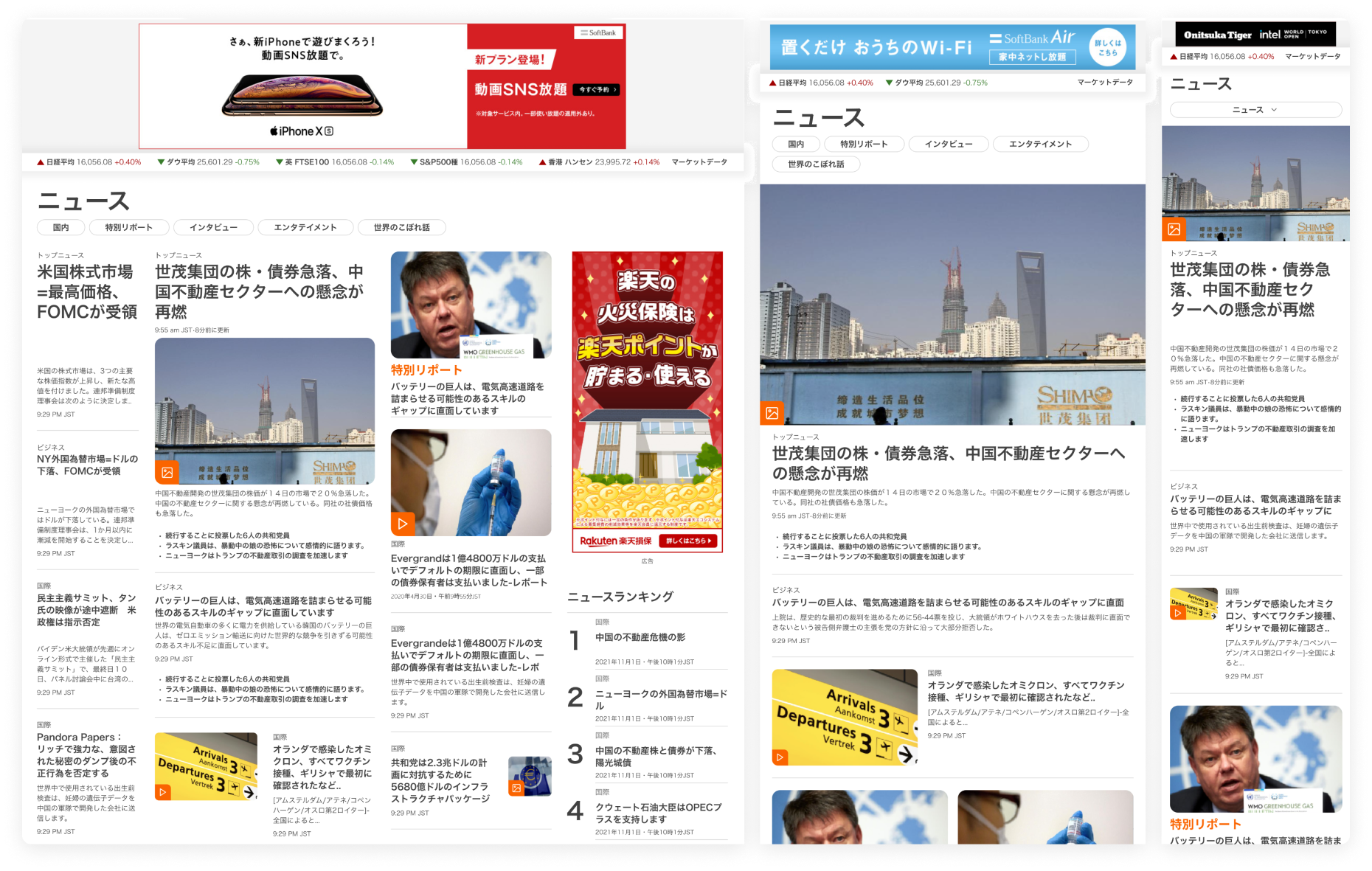
We tested for a real-life copy of each unique page within the project scope to ensure all content had been accounted for in the designs. Once we created each of the 17 unique templates, we incorporated the content to replicate what the new Reuters Japan experience would look like. We design the templates to be flexible, allowing individual components to be hidden or switched based on the content on the page.
We partnered with a Japan-based User Researcher to conduct one-on-one interviews held over Zoom call. The research allowed us to gain a deeper understanding of the habits and behaviors of Japanese consumers, specifically in the financial sector, in the context of news consumption, and to understand this relationship through existing Reuters and competitors' users.
We conducted usability testings following the user interview. These were to evaluate how well the prototype matches a user’s mental model for what a news media site should include. We evaluated the designs for content, visual design, and functionality, as well as to determine if users were able to navigate the site effectively, and overall identify any potential weaknesses within the prototype.
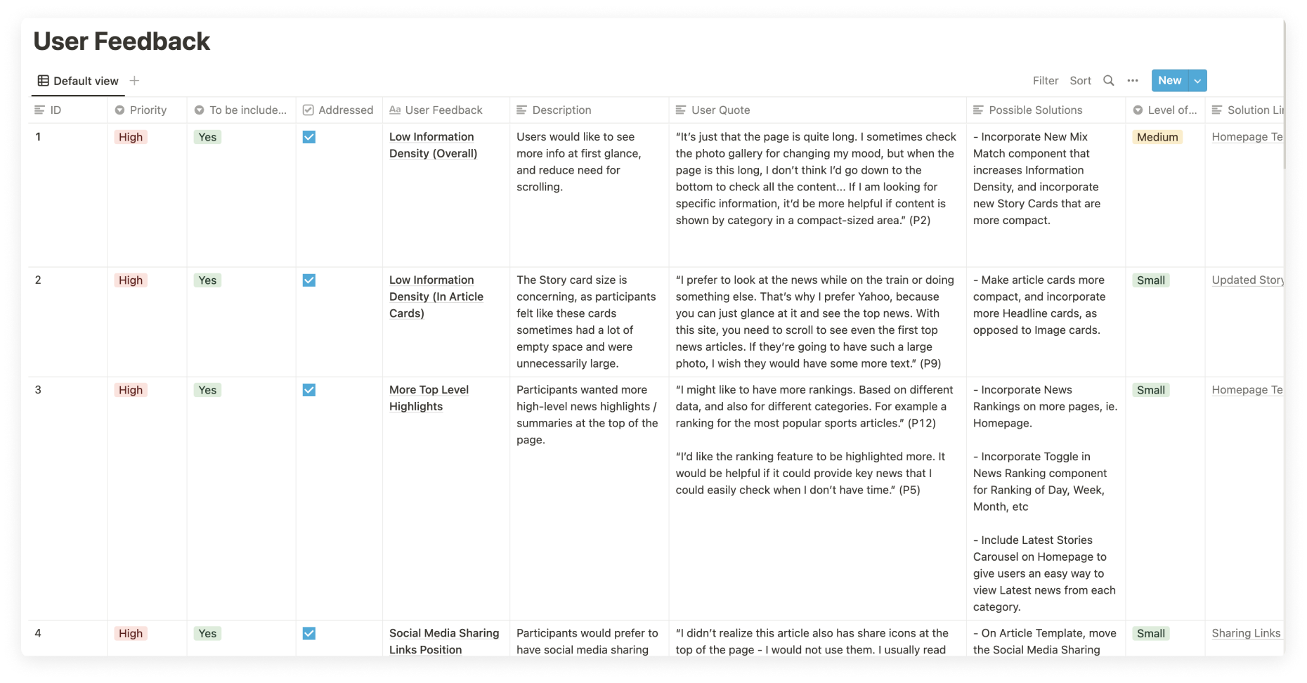
From the User Interview Findings, a list of user feedback action items was crafted to better guide the design so it best meets the needs of the users. A checklist of these items were documented in a Notion table. Details for each row item include the feedback item, description, user quote, solution, level of priority, and a level of effort to address the item.
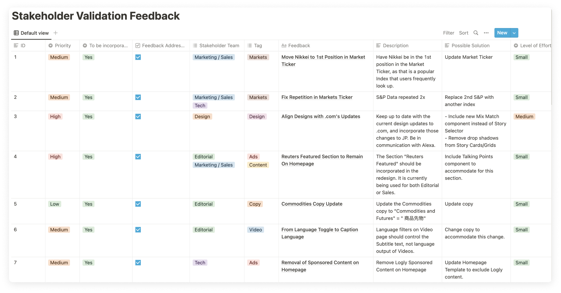
From the Stakeholder Interview Findings, a list of stakeholder feedback action items was crafted to better guide the design process. A checklist of these items were documented in a Notion table. Details for each row item include an overview, tag, description, stakeholder team that brought up the item, solution, and a level of effort to address the item.
We updated the Reuters Japanese site by retiring the legacy design system, and applying the new Reuters.com style guide, evaluated and updated the Information Architecture to streamline the user experience. We also created custom components that facilitate content and better meet user information needs for Japanese audiences, along with existing components from Reuters.com style guide.